NYCC 2011 – An Interview w/ Erik Larsen

I took the opportunity and used this year’s New York Comic Con as a means to conduct a few interviews. This time around you’ll hear from Erik Larsen.

Larsen is a cartoonist, one of the original founders of Image Comics, and sole creator of the comic book series Savage Dragon.

Larsen still produces Savage Dragon. You could even say the title has entered a new revival period as its creator takes the book and its cast into new directions while remaining on a tight schedule.

Erik was also announced as the artist of the upcoming Supreme relaunch from Extreme Studios … illustrating Alan Moore’s final Supreme script and picking up where the writer left off so long ago.

In the interview, we discuss his work on Savage Dragon as well as cover the basics of the Supreme announcement.

Click the link below to listen, or right click and select “save link as” to download the interview to your hard drive.

NYCC 2011/Erik Larsen/14:52


Leave a comment

Filed under Interviews, New York Comic Con, Savage Dragon

NYCC 2011 – An Interview w/ Joe Keatinge, Ross Campbell and Andre Szymanowicz

I took the opportunity and used this year’s New York Comic Con as a means to conduct a few interviews. This time around, you’ll hear from Joe Keatinge, Ross Campbell and Andre Szymanowicz.

Keatinge is known as the editor of  Image Comics’ award-winning PopGun anthology, but this year he plans to engage the comics industry as a writer. His new creator-owned project Hell Yeah was announced at the convention this year, and Keatinge will also assume the duty of writer  on Extreme Studios’ relaunch of Glory.

Ross Campbell and Andre Szymanowicz are Keatinge’s collaborative partners for these projects. Campbell will draw Glory, and Szymanowicz will draw Hell Yeah.

In the interview, we discuss the bare bones of these announcements and joke around as the tangents flow.

Click the link below to listen, or right click and select “save link as” to download the interview to your hard drive.

NYCC 2011/Joe Keatinge, Ross Campbell, Andre Szymanowicz/17:17

Leave a comment

Filed under Interviews, New York Comic Con

NYCC 2011 – An Interview w/ Greg Capullo

I took the opportunity and used this year’s New York Comic Con as a means to conduct a few interviews. This time around, you’ll hear from Greg Capullo.

Capullo currently provides artwork for DC Comic’s Batman, and he has previously worked on such books as Todd McFarlane’s Spawn and Haunt.

Click the link below to listen, or right click and select “save link as” to download the interview to your hard drive.

NYCC 2011/Interview w/ Greg Capullo/7:22

Leave a comment

Filed under Interviews, New York Comic Con

Con Thoughts: NYCC 2011

I’ve never really reviewed a comic convention before. Well, here it goes.

The New York Comic Con clearly has evolved into a media behemoth on par with the nationally known San Diego show. This year’s show set records, and God, did I certainly feel and experience the “wonderful” sites of that record breaking crowd. But, I did expect such a mass of bodies at this show, so I necessarily can’t hold the crowds against the con. NYCC sets out to draw the mass, 100-thousand crowd. If anything, I have to champion Lance Fensterman and Reed Pop on a successful weekend.

So, the pros and cons?

PROS

– I actually enjoyed the layout of the show floor, and I respect the separation of Artist’s Alley from the rest of the convention. I could care less about video game releases or Avengers panels. Movies will eventually hit the big screen, and I don’t own an Xbox. NYCC got it right when it chose to section off Artist’s Alley, the actual comics portion of the show, because honestly it’s all I came to the show for. And I’m sure many other Artist’s Alley attendees did the same. A separate room for the actual comics made it much easier for me to focus on what I wanted. I could ignore the bullshit and the fat kids in costumes (for the most part), and I could speak to the artists I desired to speak to. In a way, Artist’s Alley felt like its own little con. I was pleased.

-Press passes were waaaaaay easy to acquire. No line. No hassle. Thirty seconds, and the pass was mine.

-A nice array of comics professionals were available to speak to. Remembering the sites of Artist’s Alley, I recall Bill Sienkiewicz, Rob Liefeld, Greg Capullo, Mike Norton, Tim Seeley, Nathan Fox, Gabriel Hardman, Chris Burnham, Jason Aaron, Cliff Chiang, Jill Thompson, Robbi Rodriguez, and John Paul Leon possessing tables. And those are only the names I can remember off the top of my head. Plenty of other “unknowns” held set ups, and this offered some room to explore unfamiliar talent.

– Image Comics and Oni Press presented killer booths. Attractive. Well stocked. Talent to talk to. I met Erik Larsen for pete’s sake!

CONS

-For my personal taste, too much of the Hollywood and gamer culture. Again, I get why it’s there, but I don’t know, such things get in the way of the comics part of “comics convention.”

-Artist’s Alley was cleeeeeeeaar in the back of the convention. I dug the separation, but did it have to be in the back? The nerds will walk miles for their games and zombies. Make them walk through an assortment of artists on their way. You know, promote the comic books. That’s why we go to comic book conventions, right?

Yeah, those are my only complaints.

I honestly had plenty of fun at this show. Hollywood may dominate it, but a true comics reader can see the necessary sights. On a personal level, I would also call the show a success. I had the chance to meet and catch up with many of the people I respect and converse with online. Anymore, this seems to be my reason to go conventions.

Will I go back? Yes, especially if I can acquire the press pass once again. I will  pay $50 for NYCC, but a free entrance ensures any sense of me returning.  The show was fun, but I feel I could attend a smaller con, with less of a crowd, and still receive just as much enjoyment.  Plenty of comic book conventions take place in this nation of ours. It’s easy to find another one. Especially when you hold my interests. If you desire the media attractions, then yes, NYCC should rank high on your list of destinations. This is the east coast “Comic Con.” Reed Pop has them a hit!

Leave a comment

Filed under New York Comic Con

The TW Review – Moon Knight #4 – And Marc Spector goes on a date …

So I’m an issue behind? Big deal. Real life caught up with me, and the internet hit the way side. Oh well. I’m back (at least for this post), and I want to communicate my thoughts and feelings on this issue of the Brian Bendis/Alex Maleev Moon Knight series.

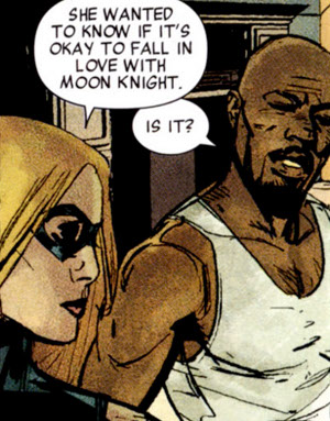
Marc Spector goes on a date with Maya Lopez this issue. They experience the conventional first date awkwardness. Spector attempts to sound like smooth talking Philip Marlowe. There’s some real talk after the failed smooth talk. Spector and Lopez engage in post-date action (interpret action however you wish).

The end.

This issue read fairly fast. I’m not stating such to mark the comic with a negative criticism. I, in fact, sometimes enjoy Bendis’ quick, “decompressed” issues that so many people seem to criticize. Granted, those light issues are the only narrative installment for an entire month, but I can live with quick bursts every so often. Not every single issue needs the seemingly demanded 200 word balloons or heavy plot. Every instance of a narrative, if we are to understand narrative as a living, breathing organism, is not long and padded. At some point the story, like life, slows down and meanders without dialogue or revelations and just skips along, leaving moments how they are.

I’m probably depicting this comic as some sort of avant garde, subtle display when it’s not. Remember, it’s a Bendis Marvel Comic. It’s a good comic, but in no ways artistically dramatic.

I’m just romanticizing quick, light comic book issues because that’s what I do, and even though it’s light, Moon Knight #4 still pulls off an interesting, complete thought.

Reading this issue, I recall the DVD extras of the Daredevil film. I think back to watching the “Men Without Fear” documentary, you know, the one where every worthwhile Daredevil creator – minus Steve Gerber – is interviewed, and I remember how Frank Miller commented on super hero sex and his portrayal of such through Matt Murdock and Elektra.

Miller used the classic Daredevil love story to express costume intimacy via the comic book fights we are all accustomed to. Hell’s Kitchen stood in for DD and Elektra’s bed room, and kicks and bounds marked each and every sexual move. Miller put super hero sex on the page but disguised it in a way that was culturally acceptable (not like this shit that happened last week). This same idea leaks its way into Moon Knight #4 via the end of the issue. Alex Maleev takes the circumstance of the book, the main sequence being the date between Spector and Lopez, and turns a climactic fight sequence into a post-date hook up, playing off of the cliche super hero team-up. His display of the battle feels like an intimate moment between Maya and Marc. It’s the first team-up, and both characters are partners in this rage against evil.

This single fight feels like an extension of what is to come. Marc Spector and Maya Lopez. Two nobodies on the west coast, alone, facing a great threat to the Marvel U.

But the depiction of super hero relationships is  not as smooth and sexy as Miller’s because Bendis keeps in mind Marc Spector’s flaw of character – he’s not the real deal.

Like any classic Brian Michael Bendis comic book scene, Spector and Maya Lopez have a conversation. Around this conversation, Bendis deploys something you’d easily see in a high school set teen movie: gossip. Avengers and Marc Spector’s head-friendlies appear, and Bendis has them act as a social panel to characterize our love birds as nobodies. It’s the super hero version of a 90s teen movie where the cool kids discuss the awkward “romances” of the dorks. I love it.

Because Marc Spector is the dork of the super hero community. As I’ve discussed before, Spector plays hero; he’s not actually a hero. Bendis uses that flaw to bring the character down to a amusing level by making him the loser of the Marvel U, and he now has a nice “girlfriend” in tow.

Then there’s the scene itself.

Like any situation, you cannot entirely trust hearsay in order to judge a person. We may understand Maya and Marc as nobodies before the scene, but Bendis sort of brings us back to believing in these characters via the date. It’s a very humanizing scene that starts off awkward yet evolves to cute. Spector flirts with his lady friend in a style I find familiar, and then carries on into a simulated, smooth talking act as he tries to find answers to the case he’s working. Once the mystery man thing fails, Spector stops himself and the real characters come out.

I love the dialogue Bendis plants here.

Marc: ” Let’s just cut the sass down and have a real conversation.”

“Wouldn’t that be nice, if two people who do what we do had a real conversation?”

Only two word balloons but they sum up so much of Bendis’ Marvel career.

But it’s also just a nice scene for the simple fact that it gets right what a date between two people should be. One half act, or presentation to attract, another half heart-to-heart. Bendis boils down the halves of an entire date to two pages. Decompression what?

What I’m trying to say is … I love how this issue cures Marc Spector of his loneliness. Granted, dude’s fictional. I shouldn’t give a single shit whether he’s lonely or not. But there’s something nice about the way Bendis has paired the character with somebody on his level. Marlene, Spector’s previous leading lady, was fine and interesting in her own right, but Maya makes a lot of sense to me. She’s underdeveloped, similar to Moon Knight, and she’s typecast. People know her as the deaf Avenger. Same with Marc Spector. He’s “crazy Moon Knight.” The character’s been subject to his own identity flaw in recent years – both in fictional awareness and in online comics culture.

I like that Spector now has an equal, and the series’ cast has a new, solid, unexpected addition. Bendis and Maleev have crafted a solid issue here. It sells the thought that even the losers can find companionship.

1 Comment

Filed under Moon Knight, The TW Review

the chemical box – episode 011 – back in the day

A new Chemical Box Podcast, hosted by Joey Aulisio and myself, is available. Here are the details…

in this episode joey and alec bitch about things for 20 minutes or so and then move on to discuss topics such as hellboy, criminal: the last of the innocent #1-2 by ed brubaker and sean phillips, captain america & bucky #620 by ed brubaker with marc andreyko and chris samnee, captain america #1 by ed brubaker and steve mcniven, daredevil #1 by mark waid with paolo rivera and marcos martin, rachel rising #1 by terry moore, and twisted savage dragon funnies edited by michel fiffe with stories from benjamin marra, ulises farinas, and joe keatinge among others.

music by local h

You can listen by clicking here, or you can download the show, in iTunes, here.

Leave a comment

Filed under The Chemical Box

The TW Review – Justice League #1

Edit: I wrote this review for the Friday edition of The Daily Athenaeum, so excuse the short paragraphs and partial breifness in analysis. That’s newspaper writing, people. Anyway, I liked what I wrote here, so I thought I would post it.

Read.

Justice League #1
Writer: Geoff Johns, Artists: Jim Lee, Scott Williams, Alex Sinclair

“There was a time when the world didn’t know what a super-hero was.”

The comic opens, and page one presents three panels. Panel one depicts a snapshot of a swat team cop. Two provides an overhead view as we focus in on a rooftop. Panel three zooms in on The Dark Knight.

There’s a progression here. We begin our focus on one form of physical fitness and evolve on to another. Evolve being the key word.

Batman on this page signifies something new or the ideal form of human police force, and by way of Jim Lee’s page layout, the old school swat member and Batman are in the midst of face off. He even draws them on opposite sides of the panel to give the illusion of each character staring off.

It’s humanity against super-humanity, and fear is in the air as both conflict over co-existence.

Or maybe it’s more a matter of discovery?

“Justice League #1” stands as the new DC comic book to begin an era and to excite an audience once more. It’s purpose as a product rests on the attraction of a new or lapsed audience, and it’s here to remind a populace of the super-hero concept’s true home.

While the line “the world didn’t know what a super-hero was” may not entirely ring true in our current cultural layout, the thought of the genre’s place and background may be a little perverted.

It’s the era of Hollywood. Iron Man makes more sense in a film than in print. People’s understanding isn’t very clear.

Not that it necessarily needs to be, but people have forgotten the comic book’s role in the super-hero genre. The medium and the genre don’t exactly match up for people anymore. They’re becoming their own things.

And this is perfectly fine. I’d rather people see comics as a medium then simply “super-heroes,” but still, capes are so much of the history. Both elements are forever tied to another.

This comic seems to remind us of that while also recalling the late 1930s as the super-hero genre first took flight. In some ways, “Justice League #1” says “this is the birth of the super-hero,” giving the comic this “Action Comics #1” vibe.

This statement, I feel, could be accurate, as this is the comic book, out of any comic book, that will provide people with a sense of new found discovery. And by that, I mean people discovering comics

The first page, if so interpreted by the audience party, provides a meta textual comment. It’s depicting what this comic book is intended to do: smash our world with the comic book awareness.

It does so in a semi-menacingly fashion, though.

Human beings fear these proto-gods, and the gods don’t even like each other. There’s nothing welcoming about it, but rather it feels like some sort of forced relation.

If desired, you could interpret this as a comment on the overall DC “all-new 52” relaunch.

Johns writes this comic well. Coming from me, this is a big compliment as I haven’t ever been a fan of this guy’s work. His comics hold too many monologues about nostalgia and too much “serious” character work for my taste.

The dude knows how to structure a story, though. I’ll give him that.

With “Justice League” I feel Johns channels a bit of another successful, modern super-hero team book – Brian Michael Bendis’s “New Avengers.”

Bendis’s Avengers work prides itself on indecisive, more-human-than-super-human characters. The Avengers may be the world’s greatest super-team, but in Bendis’s hands these characters must discuss what needs to be done rather than just act.

His version of the team is very human by way of its function. They almost work like politicians.

John’s brings that human concept to his version of the Justice League. While both Batman and Green Lantern still act quickly under fire, jumping from Gotham City to Metropolis in minutes in order to work, the characters’ relations are very flawed.

Green Lantern speaks of himself in the third person, and he cannot help but sound like egotistical jerk as he shows off to Batman. Batman is very untrusting and looks to work by himself rather than with Green Lantern.

Both characters are very godlike in their ability, but their social skills are so human.

Johns’s Justice League channels but also plays opposite to Bendis’s Avengers.

Just by nature of the comic’s character driven focus, I’d say Geoff Johns is totally trying to capture the the tone of Marvel Comics’ successful Avengers franchise.

I’m in favor of this first issue. While most complain of a lacking cast, I feel I read what I expected. Sure, the entire Justice League doesn’t appear, but honestly, in this day and age of decompression, did you really expect a done-in-one snapshot?

There’s enough action, question, and interesting character work to capture a reader’s attention, and Jim Lee back on art details is never a bad thing.

Leave a comment

Filed under The TW Review

Absent Colors

Edit: This post may not be up to the snuff of my recent writing on this blog as it is an inventory post. I wrote this back in July and never posted it. The piece was originally intended for PopMatters, but they suck and blew me off. So, here it is. Better writing will continue next week as I bunker down and create.

Still, it’s not terrible. An interesting point is made, and I feel it’s worth the time. Please only excuse some of its construction.

Hell, though, you may think it’s right on par with everything I do. If so, fuck you.

In comics, color tends to be the major indicator of tone. It can’t help but be. Above pure style or detail or simplicity, it’s the piece of comic art that makes the first impression. Why? The human eye is naturally attracted to color, or more specifically light. Our eyes respond to light. That’s their job; they take in light, process it, send messages to our brains, and our brains sketch out the world we see. Light holds no specific color, though. It’s just light. What builds our perception of color are the wavelengths possessed by the light our eyes process. When our brains decode the wavelengths though, it is believed that we make judgments of our world based on our perceptions of color. Want a healthy snack? The bright green of celery may be a good indicator.  Safe place to live? The neighborhood with the bright, red rose buds and the white picket fences probably appears secure.

If this belief be true, which I feel it is, then we are constantly reading tones in our everyday lives. It makes sense that a violent splash of red gives a comic book a sense of danger. For reason why we respond to specific colors in specific ways, I’m not sure, but there is this great essay from writer Matt Seneca on the subject (seriously, read it).

So what’s the case for black and white comic books? They certainly exist, and they certainly contain stories with emotion and idea. How do they communicate their tone? Maybe simple subject matter has something to do with it – see The Walking Dead – but I have a feeling that in the absence of color art line art carries a little more weight.

For a random example, take Eastman and Laird’s Teenage Mutant Ninja Turtles #1. A comic book that uses a lot of cross-hatching and small lines to create a feeling of grit and urbanness while populated by lines making animal shapes to build a sense of parody.

Even with color, line can still dictate tone. Sam Kieth uses many angular lines to convey the edge his work his after while Frank Quitely’s line gives off a vibe of fun energy with its round, almost wafting quality.

This next example may not be as “glamorous” as the few previous, but I’ve recently read a collection of short strips from Jack Staff artist Paul Grist that is to blame for the thought I’m typing here. While Grist collaborated with writer Phil Elliott in the early years of their careers, the men produced a handful of comic strips for magazines such as Taboo and Escape. Recently, these early strips were collected into a mini comic collection by Slave Labor Graphics which is titled Absent Friends. I, believe or not, obtained my copy via Erik Larsen’s garage or at least an associate of his who obtained this Larsen-garage treasure and then sent it to me. Yeah, sorry, I had to name drop. Anyway, these tales explore the usual ideas with stories of friendship, career, and sex, but they do so without coming off as just another “auto-bio, young man’s view of the world” comic. Even though they do cross the usual thoughts of indie comics, these strips do so very well by simple fact of their craft. Elliott writes a story that never spells it all out. His scripts are tight and fast paced. You never really get it all on the first read through, but you still get enough to entice you back for more. The second reading is when narrative details pop; a quality I’ve never really seen in short, vignette comics. There is actually something quite short story, or even Hemingway about them.

I’m here to talk about Grist’s work, though. As you recall, this post did start out with thoughts of visuals and tone, and I feel the work in Absent Friends really is a nice example of tone through line work. Grist is well-known for his charismatic, dynamic style because of his comic Jack Staff, but Absent Friends carries more of a rigidness. It’s not bad rigidness, like Alex Ross or recent Scott Kolins would present, just rigidness in the sense that this is a young artist, as of yet, without a particular style, and in the context of Grist’s current work it’s comparatively stiff next to Jack Staff.  Grist understands mechanics and can tell a story, but he just lacks a flamboyant style that comic readers are accustomed to.

The rigidness is one of the techniques that convey tone, though. As described, these are stories about relationships, lost friends, and struggling artists, so the stiff, more serious aesthetic of his line actually works well to communicate the point that most of these stories are not to be laughed at but rather thought about. The line art is very blunt in it’s nature. This work well for these comic strips because writer Phil Elliott, while not spelling everything out, is sort of blunt in his storytelling, or at least the nature of his narrative is very visceral. It’s not visceral in a violent sense, but the stories do present their events in a very forward fashion. The approach could be described as  “Look, this happens. Now, it’s over. Move on. Think about it when you’re done reading.” The sort of up front, no flare about it artwork Grist creates reflects this tone very well and furthers its transmission.

Grist also gives attention to his backgrounds for the cause of tone. Absent Friends isn’t one-hundred percent serious. There are a few, I guess you’d call them, “gag strips” or humorous takes on relationships throughout the collection. They’re intermingled, and the collection transitions through an array of emotions. Grist helps separate these stories by taking advantage of or destroying open space. Stories that exist to be taken a bit seriously usually contain panels with cluttered backgrounds. Grist uses devices such as rain, snow, simple cross-hatches, or a wide array of dispersed objects to tighten up the panel. That tight, almost claustrophobic feel contains the reader into a certain emotional mindset. The humor strips are the opposite. Grist leaves a lot of white space in the backgrounds, lettering and sound effects appear enthusiastic, and even character’s heads are a little more round and cartoonish. The humor stories, because of the environment Grist puts them in, look very dynamic.

This is an early work from Elliott and Grist, but in some ways it feels like years and years of experience were on hand when they made the stories within Absent Friends. These comics are well crafted, and while printed in black and white, Grist makes use of the line art to sell the heart of these stories. More importantly, Absent Friends made me consider the role of line art. I tend to think it’s job is simply style and obviously building shapes, but there is more to it, especially when you read a comic book that takes advantage of it. Color will always be the dominate messenger of tone, certainly, but I think next time I read a comic I’ll study the line and see if it too is sending a message.

1 Comment

Filed under Uncategorized

Butcher Baker, the Statement Maker

Joe Casey wants us to wake up. He’s screaming in our ears. “Hey, fuckheads! Put it together!” For some, a rude awakening. For me, a welcome cry.

I never enjoy being the “all comics suck, especially the cape ones” guy, yet, at times, I slip into that mindset (especially if I’ve read Fear Itself). I join the crew of the hyper-critical, and we chant via our internet connections of how much we hate everything. Actually, I lied. Sometimes that mindset feels splendid. There’s a certain air of “above it all” that comes with the hate. You feel ahead of the curve. At least, I do. At some point though, you realize the amount of negativity you spout and things turn dark. You look at yourself in the reflection of your computer screen and beg the question: am I negative for a justified reason or am I hating to hate?

The “all super hero comics suck” label seems too easy to apply. It goes beyond the reasonable complaint of limited creativity to levels of nothing is possible in the genre. Sure, the genre has its problems. Creators get fucked, progress isn’t always made, and comics resemble product rather than art. The corporate lock down and fan culture provide plenty of reason for people to disown the angle. It even encourages it.  Small press suffers the same issues, though.  TokyoPop completely fucked Brandon Graham, the black and white boom felt more like early Image Comics than progress, and the number of publishers pushing panels of licensed properties goes uncounted. Small publishers suck just as bad. The flaws of comics go beyond the capes. It’s comics as a whole.

Still, for some, there’s nothing beyond Fantagraphics and PictureBox. The output of Oni Press doesn’t apply to them. My argument doesn’t apply to them. Whatever. For those who state an open existence though – the people in it for the art and seeing the world in open terms – it seems pretty fucking stupid to limit your reading. Sure, hero comics contain a lot of bad, and sure, few contain the passion and personal touch of art, but if  any of those things were the case, super hero comics seem like the most likely place. Motherfuckers fly in these books. I’d say a lot’s possible. And – super hero comics hold a certain place in the medium. To ignore them or brush them off only signals a being living in a bubble. In some senses, cape comics are the medium, at least in terms of identity. Study that. Learn from that. Invite the cape and cowl in and let it join the house party you call context.

Joe Casey proves the potential and awesome of super heroes with each issue of Butcher Baker, the Righteous Maker. He sends a statement to the art house goon, the mind-mushed hero reader, and the comics professional. The super hero isn’t a bitch; the super hero has balls. Such detail is built into Casey’s lead and book namesake, Butcher Baker, as well as the up front, hyper-active aesthetic of the comic. But I wouldn’t even limit the cry to super hero comics. As typed above, small press or guys like IDW, Oni, and Dark Horse can suck just as bad. Hell, even Image who publishes the work of the industry right now publishes some shit (*cough*Invincible*cough*). As we’ve learned, it’s not about limiting one’s self to a specific area of comics or literature. The mission pertains to an all-encompassing mind, and Casey is a smart fucker. This dude speaks a little something to everyone.

But, hey, comics books are about pretty pictures and cool looking shit. Let’s talk about the bitchin’ work of Mike Huddleston.
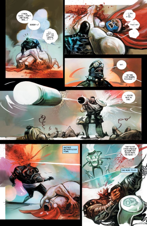
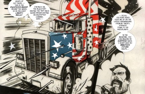
So much happens in this comic because of Huddleston. Casey inspires the work and sprinkles in the bits of manifesto and meta, but Huddleston sings the fucking song. His art spotlights many approaches, techniques, and tones to create an air of sophistication and complexity. Baker is not a comic to sit and stare at a consistent color choice or line. Huddleston flashes between neon and grainy black and white. Speed lines touched by a manga flare decorate fight scenes. Cross hatches and angles bend lines to an edge. My descriptions of art only go so far, but you get the idea. Mike Huddleston fills Butcher Baker with a mixture of approaches. The question to ask: why?

When reading comics (or any type of literature), always ask why things are done the way they are. That’s basic 9th grade shit, but it works. Techniques and narrative choices spawn from more than just accident. Everything contains a purpose. In the case of Huddleston’s art, I’m sure there are numerous – NUMEROUS – reasons. The dude no doubt possesses more brain cells than I, so I’m certain his artistic choices run deep. Too much happens in Baker in terms of visual expression for there not to be detailed reasons. I believe I can offer one, measly, bullshit reason, though. Huddleston’s art is on the constant move. Every scene works under different circumstances, and while I’m certain each scene looks the way it does for a specific purpose, I’m more interested in the general idea of change or the simple notion of complexity.

Casey shines a spotlight, aiming the bright, phosphorescent bulb on the super hero and the genre’s ability to preform. From that, we’re seeing the genre’s multifunction. Casey’s telling a high octane, “last job” thriller, but he’s also documenting a very personal journey. Much of this book is Casey’s career in comics deployed through the Butcher Baker analog. At the same time, the book offers character study.  The old war hero forced back to the life of combat. How’s that work? Butcher Baker, mentioned in this blog post’s title, also presents statement, a manifesto from Casey communicated through the genre and comic book as media.  The comic book as media … yeah. The spotlight, the statement, the study … it’s on the super hero, but again, no limits, Casey shows us the multifunction of comic books. Comic books in general, as form, rather than keeping to one section. A lot of change and movement exists in that goal. It only makes sense Huddleston’s art be so shifting. At least, in a collaborative sense. The artwork echos the writing. Provides emphasis. Huddleston’s complexity in style and technique is the visual hand to the face to push the idea through the eyeballs. Casey says comic books can do it all, and Huddleston backs him up.

Most comics keep to the single, visual vision. Reasons vary. Mostly, it rests on creative restriction because of risk of readers freaking the fuck out. Readers lose shit when comics lack realism, resemble manga, or go black and white. Huddleston brings all of that, though. He tells the notion of drawing “house style” to fuck itself. “House style” doesn’t know. It wants a set visual when comics could present so much more. The “so much more” never sees the light of day, though. The need to satisfy “house style” mentality boils strong, so artists force out status quo images. The art of Butcher Baker represents a sexy middle finger, and it yells at everyone, “hey, get a fucking load of this!”  A load of what, you ask? Metaphorical testicles communicated by the artwork’s aesthetic. Simply said, Huddleston’s work is pumped full of testosterone, and it follows Casey’s lead in that comics know no bounds.

The statement of Butcher Baker matters, and a main feature of that equals Casey’s personal touch. Baker feels like a very cathartic work of fiction.  We have some knowledge of the bullshit Casey’s dealt with in recent years. DC rewrote a few Superman/Batman scripts, and this obviously affected him. Maybe other things have happened as well. But the DC incident is the public one we, or I, know, and, you what, it’s enough to inspire the self-therapy Casey’s exploring. Baker contains a specific timeline, and it can be traced to match the experience of a comics writer. Issue #4 depicts a younger Butcher Baker – in his prime, the super hero of legend – combating against a villain in the middle of a desert. As the fight romps on, dialogue appears:

Butcher: “This place … kinda’ like the Wild West, eh Gator?”

“You think you can hide out, but it’s still Cowboys an’ Indians …”

“… while the goddamn world ends all around us.”

The Wild West. Cowboys an’ Indians. A good way to describe comic books, right? A medium with such potential and so much room for a pioneer to work with, but really it’s chained down by industry standards to play out the same old fights, over and over. Butcher speaks of the world ending as well. I take that as, “you can try to hide out in comics, doing something important, but while you play what’s really a dumb game, real shit is happening in the world.”

Gator is put down by page 2. Butcher than hands his mask over to an army officer and walks away from the scene.

Butcher: “Chasing super-villains halfway across the globe had me feeling like I was trapped in a Roadrunner Cartoon …”

I feel the line speaks for itself.

Issue #1 would be where we first meet up with Butcher in the present, years after the flashback. He’s living in his grotto, banging multiple chicks, and drinking. The dude’s all over the fruits of retirement. Then come Jay Leno and Dick Chaney, whom could easily be interpreted as Marvel and DC as well as other things. But for the sake of the point I’m on, let’s stick with Marvel and DC. These guys bring Butcher out of retirement to fulfill a mission. The mission, blowing up a high security prison in order to kill a bunch of super villains, goes wrong and Butcher is left with a mess to clean up. The mess being a number of old foes such as a behemoth named “Angerhead” who spouts lines like, “My hatred will fuck you up!” Even though higher powers sent Butcher on this mission, he’s on his own to clean the mess. Hell, the high powers look to cover their asses and send in military force to fuck Butcher. There’s even missiles sprayed painted with the phrase “fuck you” fired at the Righteous Maker.

This reads like an account of a comics writer picking up mainstream work and then realizing the mess it can be. Some creators claim to do very well under corporate structure. Guys like Brian Bendis has flourished and still produce solid work while being the company name. The other half of the story exists, though. Casey would most likely be the poster child. Lines like, “Those assholes promised I had their ‘full support’ on this mission – is this what they meant? The first sign of trouble…they turn their guns on me, too!?” totally fit Casey.

“But it never fails. The white men in their black suits…they want what they want. And I’m expendable. Fuck me.”

It’s like the reaction of a writer going in, trying something exciting under a corporate umbrella, and then discovering the company men are pissed and will fuck you hard to fix what you’ve done. This element of the story actually provides an interesting contradiction. As typed, most of this book sets a goal to present the awesome and capability of super-heroes as genre. It’s almost like a pep rally in comic book form. So why show the darker side? I believe it’s to discuss the issue of super-hero comics entirely. As we all know, creator rights have once again become the big, controversial issue in our daily Twitter feeds. And you know what? Good of those people concerned. It’s an issue that demands dealing. But as we all come to question the moral behavior of our heroes’ homes (the publishers), we reach a point of contradiction. We all favor creator rights, and I bet quite a few would give an arm to get Kirby is rightful due, but when you boil down the argument, how many can actually boycott Marvel? A sense of evil and moral question disgusts us, but we also love the story potential of capes. We reach a point of enternal struggle. What do we do here?

Baker’s at the same point. The dude wants to enjoy the life but constantly suffers from its seedy side. He is us, and he is Casey, locked in a world of indecision and contradiction, trying to make any fucking sense of it he can.

And then Butcher makes a break for it after a bloody battle in Times Square. He disappears like a criminal after a successful heist, beaching himself in a resort spa. Not the place for Butcher. The dude can’t escape the thoughts of heroing and who he is. Butcher contemplates what’s next for him.

The writer cannot just leave the field even after a hard fucking. The writer has to produce. It’s who the writer is. Resort beaches and bullshit small talk are not him. But what else is there other than the game he’s already played? Same goes for the reader. Once you see the potential of comics, how can you leave forever?

Butcher Baker sees a lot of time as an analog character, and honestly you could probably spend a few hundred words or more discussing analog characters in this comic. The entire cast of villains thus far seem to each speak a specific personality, and there is as well Arnie B. Willard. This determined, beer-gut of a law man comes as a bit more difficult to pin down. I’d say he represents another side of Casey, though. Just because of his ying/yang connection to Butcher. Issue #5 really gives me that vibe. When the transgender force of universe provides Willard with a higher sense, his thoughts and Butcher’s intertwine. Both characters take a trip to each other’s head, and it’s from this we learn Willard wants to be Butcher. He’s the law man who loves dishing out justice and hates his fat fuck of a wife, and Butcher appears appealing by way of his many female friends and beefy, Liberty Belle truck. It’s all in this head trip process as Casey writes in an Alan Moore image/caption juxtaposition.

The important fact would be Willard’s action of chasing Butcher. He’s chasing him to lay down the law, but his transgender friend offers a little more insight. She (or he) claims Willard must seek the ultimate truth, and from the pages in the comic it seems the ultimate truth lies with Butcher Baker. So, if Willard does represent some side of Casey, what is it that Casey finds in Butcher Baker, which I would say is another piece of him?

Willard could even fit the contradiction theme. A lawman hunting a vigilante, yet he secretly desires to be just like him.

The answer is where this series is going.

Now how the fuck do I wrap this up? I suck at conclusions. (you may even think I suck at writing. period.)

It’s like this: comics can do a lot. We live in an era of Hollywood R&D and formula. Comic books sit in the shopping carts of suits and then meet check out upon option. Nobodies’ taking it seriously until it hits the silver screen. Nobody. Except for Joe Casey and Mike Huddleston, two dudes on a mission to prove the comic book’s versatility and creative potential. Butcher Baker, the Righteous Maker contains a mix of levels and “abouts.” It’s a comic book that’s proud to be a comic book, and it’s doing things only comic books can do. In a collaborative manner, I might add. The book even teaches a lesson for the already comic book faithful. More is possible, and super heroes, the go-to blemish of the medium, can transform and do new things while offering personal expression. For some, the manifesto may not be even be enough, but remember, this series is 5 issues old, and Joe Casey seems totally open to change. I’m sure Butcher Baker will develop with the time as well as develop with its author’s voice. This would be the last comic book I’d expect to go stale.

It’s the best motherfucking book out there.

4 Comments

Filed under Uncategorized

the chemical box – episode 010 – double digits

A new Chemical Box Podcast, hosted by Joey Aulisio and myself, is available. Here are the details…

in this episode joey and alec discuss supergods by grant morrison, batman incorporated #7 by grant morrison and chris burnham, the wolverine’s revenge storyline (wolverine #10-12) by jason aaron and renato guedes, the mindless ones website, brandon graham’s comics journal interview, hate annual #9 by peter bagge, the similarities of approach between peter bagge and erik larsen, and we answer some emails, among other things.

music by †††

You can listen by clicking here, or you can download the show, in iTunes, here.

Leave a comment

Filed under The Chemical Box