Tag Archives: Batman

Priority shipping was a waste

Batman_Dark_Allegiances_01

Howard Chaykin starts Batman: Dark Allegiances with a borrowed image. The iconic superhero is framed to fit Jack Welch’s 1955 Jello ad campaign, the conical element of his decorative cowl prominently on display. His eyes, though, suggest a man who’s lost the grip of his identity, it co-opted for another cause. Following this image, Bruce Wayne / Batman, via narrative captions scripted by Chaykin, explains to the reader why he’s different than a member of the KKK as he subsequently pounds this mob into the ground. He sees them as men “pushed to the wall of frustrated fury by the brutal nature of the times.” And while they wear masks, his is more like an onion skin, meant to be peeled to reveal the numerous, complicated angles that pertain to his person.

Chaykin imbues Bruce Wayne / Batman with a youthful vigor even when flamboyantly hateful people are his targets, and they to him. In this Elseworld’s interpretation (a DC Comics imprint dedicated to variations of familiar characters), Bruce, essentially, never grew up. He’s a playboy industrial designer who wants to offer the world a theme park as his next venture, playing cowboy on the side. Chaykin draws Batman as if he’s a coiled spring bouncing through combat. He glides through the air and blocks bullets, and in some panels it’s as if his arm detaches and simply maneuvers through a crowd of foes, knocking each of them out like soda cans along a level fence, subject to the hand of some passerby kid. Violence of little consequence. 

Chaykin’s Bruce Wayne is nothing but a guy equipped with a square jaw and blockhead smile, eager to say something clever. Despite Kitty Grimalkin’s (a Catwoman stand-in) task to threaten Wayne, he, knowing so, is only excited by the notion of having an attractive woman at his side involved in such a plot. He never takes her seriously. Even though she knows his secret identity, he won’t give her the credit of it. And when she explains what brought her to him (a case of blackmail involving a pornographic film Grimalkin is the star of), Wayne mocks the idea, suggesting they should steal the film back and watch it.

These interactions characterize Bruce Wayne / Batman as a man happily at home within his delusion. Others have offered the interpretation of Batman as someone who’s misunderstood himself, most notably Alan Moore with The Killing Joke, but Chaykin offers a character who sees the signs, and chooses to ignore them. As the character indicates in the comic’s opening sequence, “If I start worrying about that, I’m in deep trouble.” So rather he fights and smiles, clinging to his botched idea of world order because it gives him purpose and pleasure. Of course, this is also Chaykin just choosing to have some fun, and that choice reflects much of what Batman readers do when they pick up a Batman comic. They’re deciding to engage with a ridiculous idea simply because it seems like fun, and little thought is required.

But, with those elements in mind, Chaykin sheds some sort of truth, and you can certainly paint a damning portrait from it. That of a man conscious of a world and its bruises who looks the other way, with a hedonistic twinkle in his eye, aware of opportunity.

That man isn’t fiction.

The Welch ads show animals in profile eating or serving Jello, and they’re accompanied by captions describing their specific physical traits. Those traits then emphasize the great promise and excitement of Jello, as product, dining accessory, and conversation starter. Chaykin’s image lacks the dessert and caption, but the basic principal of the image is the same. A creature of the world removed of its habitat and self, held so a reader may stick it next to something else to take it apart and measure it. 

In essence, that’s Chaykin’s approach to Batman. Take a brooding totem away from its emotional ghetto, and supply an opportunity for it to laugh at itself. When Chaykin says the book is about “Hitler in a Hawaiian shirt” in Howard Chaykin: Conversations he’s not wrong. It is. But it’s not without the stoic Welch image at the front, placing the character in context as the pop culture product Batman is. A character under the cover of a plated cowl, protected from the world his eyes see. As a character – real in his own reality – he operates individually as his emperor of self, making decisions, inspiring consequence by taking the law into his own hands, but as an image he’s just something to be used or briefly considered. A figment of the mind, like Adolf today, he can be dressed in a Hawaiian shirt for laughs.

Leave a comment

Filed under Uncategorized

NYCC 2011 – An Interview w/ Greg Capullo

I took the opportunity and used this year’s New York Comic Con as a means to conduct a few interviews. This time around, you’ll hear from Greg Capullo.

Capullo currently provides artwork for DC Comic’s Batman, and he has previously worked on such books as Todd McFarlane’s Spawn and Haunt.

Click the link below to listen, or right click and select “save link as” to download the interview to your hard drive.

NYCC 2011/Interview w/ Greg Capullo/7:22

Leave a comment

Filed under Interviews, New York Comic Con

The TW Review – If Spider-man could finally get his shit together …

I feel the sudden urge to write random, short reviews of new(ish) comic books.

When in all reality there exists a more than sufficient amount of review material on the weekly paper chase of the direct market, I in this instance lack concern and will contribute. Mark me up with the majority of comic book bloggery! I shall write quick hit segments that few will read and fewer will remember beyond this day of “publishing.”

This past week consisted of my mission to catch up on the monthly fodder, and I feel I should produce at least something with the probably lack luster thoughts and opinions I now possess.

So, yeah, here’s some bullshit I spent a night typing …

The Amazing Spider-man #666 – Spider-Island Prologue
Writer: Dan “the excited” Slott, Artists: Stefano Caselli, Marte Gracia, Joe Caramagna

I’m a huge (not literally) Spider-man fan, in case you didn’t know. This particular fictional figure really was my first point of interest in comics. As we all begin, we’re in it for the 2-D gladiators and their excursions.  Spider-man was and still remains my dude, and there’s been plenty of, I hate to say “discussion” but I guess, discussion on the character lately – there’s a film reboot on the way and Glenn Beck suddenly gives a fuck what color the kid from Queens is. My own personal spider-sense tingles from all this talk and a new found enthusiasm for the web head boils inside me. The time is now. Let’s see what Peter Parker’s up to these days in his pulpy home of  ‘The Amazing Spider-man.’

Dan Slott writes the exact kind of comics I yearn to stay away from. Stupid recesses on why such fictional things are cool, along with useless plot updates, seem to be this scribes money making characteristic. Every time I’ve read his Spider-man, the book devolves into some mess of, “hey, let’s see what The Thing is up to! You know why? Cause Spider-man KNOWS The Thing!”.  Just stupid shit like that. He’s the type of writer who invests a little too much in the fictional world he’s left to curate a.k.a. the purest example of a fan writer. This results in a constant parade of subplot catch up.

I’m sure the dude really is nice and all sorts of fun to drink with and I totally understand the need to incorporate the supporting cast in a title such as ‘The Amazing Spider-man,’ but Jesus, God I don’t give a fuck what the reason is for Peter’s costume change between his time with the new found Future Foundation and The Avengers. I’m sure that was a run on sentence, but it’s how I going to express the point.

OK, now that I’m finished with my poor attempt at sounding like Tucker Stone, who’s a great writer by the way, let me break down and review the issue how I normally would.

The first few pages satisfy me, surprisingly. One of my biggest beefs  as a “fan” of the Spider-man character lays in Marvel’s inability to allow Peter Parker to grow up. His story, along with the core of the Spider-concept, stands most potent in the years of youth. Ditko and Lee engineered this hormonal mess of hero as a Shakespearean observation, and his saga works throughout all time as well as in the culture change and teenage uprising of the 1960s. Youth is important to the character, but I guess the fanboy connection I possess wants me to witness a changing or aging Peter Parker. I carry this urge to watch a fictional being learn and grow as if he were real rather than living a trap of repetition. Peter’s always fucking up, losing his job, not getting laid, or letting someone die. He so lacks efficiency. Again, the core, I know, but you can only read so many stories about a fuck up. You know why? Because at some point you learn this dude is always going to fuck up, and that grows so old so fast. I’d rather not read.

Slott progresses Peter Parker for a few pages, though. Right in this issue.  Peter’s recent deal is that he’s sitting comfortably with a new, fancy science research job, the gig he’s always wanted since implied way back when in 1963. Along with the gig, Parker keeps the company of a new lady friend, acts as a member of two super-teams, and kicks ass as a solo crime fighter.  This Peter Parker represents the efficient, responsible character that Marvel has potential to publish. Granted, the conflict of fucking up is lost, but maybe a responsible, non-fuck up Spider-man would encourage a little more creativity in the House of Ideas? It could pull Peter Parker in a new, interesting direction. And, for a few pages, that direction wafts hopefully before my beady, spider-loving eyes until Dan Slott progresses to suddenly make me not want such a thing.

We the readers understand perfectly well that Spider-man jams efficient, but Slott feels the need to shove it down our throats. The expected subplot, continuity parade storms on by with Slott leading the damn thing as King Same-and-Stuck. The pages flip on by. J. Jonah Jameson shouts his concern and damns the arachnid. Norah Winters, cast member and friend of Peter’s, has a douche bag boyfriend who’s secretly a villain with a goblin persuasion. Aunt May still lives. Flash “the venom” Thomspon stops by because he lives in New York. Betty Brant uses a cell phone. The Avengers play cards only after the Future Foundation hit the wardrobe. Spider-man fights in a dojo for his daily workout.

Slott literally shows us every fucking thing Peter Parker now does as well as showing us everything his cast does. And he doesn’t just show us, he takes an entire issue to show us these bland explanations continuity nerds eat up. God help me.

The issue eventually finds an end where it manages to introduce this “event” known as Spider-Island. The idea? The Jackal, spider-villain known for the infamous “Clone Saga,” desires to clone once more but this time create an entire “island of spiders!” Honestly, I’m not sure how I feel about this concept. Part of me says, “repetitive” and “why care,” but I hate to blow off a concept before it’s really used. I believe there’s potential in an “island of spiders.” We will see, I suppose.

The artwork is wonderful, though. Caselli captures a great sense of motion in this issue. Images feel kinetic, and Spider-man appears truly super as he swings across the landscape. The line work appears clean and distinct, and the figures drawn convey a real sense of acting. Along with the fresh colors provided by Gracia, I found the visual aspect of this issue quite satisfying.

Will I continue with Spider-Island? I must enjoy torture, because I might. Might. I’m still interested in how this concept finds use by the creative team, and I am experiencing a new found interest in Spider-man. So, yeah, I’ll go hang out with the only dude crying over the demise of Wizard, and we’ll discuss how much we hate these hero comics and how they ignore what want even though we continue to purchase them.

Spider-Island Part 2 will, most likely, be mine.

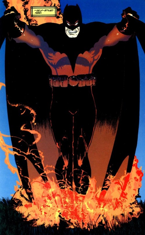
Batman: Knight of Vengeance #2
Writer: Brian Azzarello, Artists: Eduardo Risso, Patricia Mulvihill, and some dude named Robbins

Now I can type with a positive tap.

Azzarello and Risso impressed me with 100 Bullets by not only its striking narrative but its master craft. That comic book, ladies and gentlemen, hits every fucking note, and it exemplifies a collaboration where both sides truly contribute to the world building. Azzarello brought the language and tone while Risso defined the style and flow. The case remains the same on this Batman comic that, I have to keep telling myself, is an event tie-in.

Most artists portray some sort of style, and that style usually manages to label that artist’s drawings. Like, you know, John Romita Jr’s New York City stands clearly distinct from Alex Maleev’s New York City. Each artist, by way of style, possesses their own and belongs to their own artistic sphere. Risso really pulls that idea to another level where his style not just stands for “Eduardo Risso” but rather a “Risso Universe.” I get the feeling that Risso’s drawings all exist on the same plane. Not many artists communicate this idea to me. Plenty of artists have distinct styles and define looks of certain objects or figures, but only Risso strings his depictions across one common field of existence. How he does this, I could honestly make no case. Maybe it has something to do with his attention to style, whether it be people’s dress or the styling of his settings, but digging into art that far lays beyond me. Simply said, I can’t help but wander into this comic and feel right back at home in the world of 100 Bullets.

Call me stupid, but that’s how I connect to this comic. It makes sense to me, though. 100 Bullets encourages you to wonder what lies beyond its gutters, and in my wondering I stumble upon an alternate version of Gotham City.

I love how Azzarello, when on his game, tells his stories. While most comic scribes today worry about sufficient word count, Azzarello comes off as a minimalist. I mean, flipping through this issue, I guess there are the standard number of word balloons, but the content of said word balloons express far from standard.  His dialogue acts the opposite of most comic dialogue. It’s not slow or exposition influenced but rather comes off as self-existent. What the fuck does that mean? OK, most dialogue feels like its meant to be read, like somehow the dialogue itself is self-aware and knows its part of a story. Azzarello’s dialogue makes the reader feel like he or she is a true fly on the wall. The characters know what’s what, and that’s all that matters as they act out their parts. As a reader, you truly watch and piece the story together by what you see and “hear” rather than being fed everything.

A grand example of such writing resides in Azzarello’s characterization of one Thomas Wayne. Not once have we witnessed a flash back nor has Wayne directly addressed us, but from observing character interactions and the simple fact of a Bat costume we understand Thomas Wayne as an angry old man with family issues and strong memories of failure. And it’s all we need.

For its premise of alternate Earth Batman, Azzarello and Risso knock it out the park. It remains unfinished and could lose steam, but the team has gone above and beyond. Their Gotham sits clearly distinct along with it inhabitants. The comic feels more like a goddamn Elseworlds than some event tie-in. Oh, and with the addition of this issue’s cliffhanger, I can safely say I actually feel the fear and conflict of this story. Something feels at stake, and it’s refreshing for a DC cape comic.

Next: Another Batman comic and a character everyone loathes. 

Leave a comment

Filed under The TW Review

Thoughts: First Wave #1-6

Too bad this failed. It had potential.

Not that I am a big supporter of the golden age or pulp heroes. Most of them uninterest me and bringing them back just feels regressive rather than cute. With Brian Azzarello’s voice though, the golden age suddenly peaks my curiousity. I am in no fashion a huge Azzarello fan as most of his work still remains unread by me, but I have experienced the epic 100 Bullets. That comic and its well focused narrative are enough to keep Azzarello’s name in my sight line. Plus, the concepts of power and agenda tossed around in 100 Bullets seem to be appropriate for a story about golden age super-heroes. They walk as gods among men, and being set in some form of the DC Universe (because, you know, of Batman) they represent the first of a new breed. As George Washington would like to think, precedence is everything, and these characters are setting it for the “superman.” Power and agenda have a lot to in that situation. At least, that’s how I see it.

Some of these ideas were brought about in First Wave. Azzarello touches upon being post-human and leaving a good example. The story just falls on its execution, and it sometimes becomes down right confusing. First Wave involves a plot where Doc Savage, The Spirit, and Batman are all brought together to stop a post-war mad scientist, and this scientist’s mad scheme seriously feels like a rip-off of  Kevin Spacey’s Lex Luthor. Not that I even mind a threat similar to something I have seen before. There is plenty of room for a writer to approach common threats  from different angles, but the Superman Returns threat, Luthor building his own island, was pretty weak to begin with. A mad man running off to his own land is in no way comparable to a mad man invading the citizen territory. The invasion factor creates  fear by taking away the idea of santuary. Mad man on his own island? Oh well, at least he is not bugging the rest of the world. Azzarello then brings nothing new to this conflict. He still directs the characters toward the super-island where they sneak around and fight henchmen. A dinosaur does appear, and it does fight The Spirit – which is kind of cool in a weird nerdy way. That’s the extent of excitement in the fight, though. Especially since Rags Morales brings absolutely nothing to this comic besides artwork I would rather not look at.

Morales likes to split the page horizontally…a lot. Now while this technique can be affective in conveying a widescreen sensibility, a horizontal split can disrupt a page’s ability to build a sense of speed. Smalls panels or large-count grids add something to a comic’s pacing. They can cause the reader to read faster as their eyes do not linger on small panels as long as wide panels. Look at this Savage Dragon example:

Small, little slivers of the page (the whole page can be seen somewhere else on the internet). This example comes from Savage Dragon #168, the conclusion to the book’s “Emerpor Dragon” arc. Erik Larsen captured much excitement from the audience with this story, and this moment acts no different as the conclusion draws close. This point in the plot shows the meeting of Dragon and Darklord, a character important to the series, and it stands as a scene of excitement and pushes the reader toward the resolution. The artwork and panel design reflects that completely. Ignoring the dialogue, you zip through this portion of the comic at a rapid pace. The panels feel like brief flashes, the sense of claustrophobia they carry increases the reader’s heartrate, and the close focus along with the bright flares of red and pink grip the eye’s focus.

Now look at the Morales example:

Long, dimly lit panels that seem to carry a lot in their gutters. For a helicopter boarding a plane, you would think the prensentation would appear exciting, but no…Morales gives us one, measly, wide panel and expects it to completely capture this action in the story. There probably is much more to landing a helicopter within a plane than one long focus shot, but no attempt is made to show it. Instead, the details lie in the panel gutters and the story gains no sense of visual appeal or energy.

The coloring on this book also acts a detriment. I understand that colorist Nei Ruffino is probably going for the “noir” look, but I think the dimness in his colors really adds to the snore factor this comic suffers from. Never did my eyes perk up. Rather, they fell into a state of drowsiness, and I honestly had a hard time finishing this comic because of how unexciting it looked.

Let’s get back to the “confusing” statement I made earlier, though. I jumped over it. Azzarello threads this plot together in a jarring manner. The cast starts out seperated but then must come together, but they come together in a car crash way. I really cannot even remember how Doc Savage meets Batman and Batman meets the Spirit. Why? I don’t even think I knew when I read it. It just seemed to happen. The Spirit is tricked by some scum bag to investigate a suspicious delivery truck, which then turns out to house Doc Savage’s father’s body. Bruce Wayne (Batman) is contacted by the mad scientist to join him, so Bruce ends up on the island. The rest show up at some point. Granted, Azzarello does spend time jumping around the cast in order to show their progression through the story, it’s not like he just literally throws the cast on the island, but the writing makes it feel that way. The subplots never feel fully form, and the main conflict actually feels undetermined until about halfway through the series.

I am also confused as to when this story takes place. Guts tells me post-WWII, around the time the actual golden age of comics took place, but other details within the artwork seem to suggest otherwise. Character designs span from clothing that looks 1940s-esque to football jerseys and outfits that resemble the modern day. It just comes off as inconsistant. Plus, it does not help give this world a visual definition. The intergration of modern day technology could help defne the world. Like a juxtapositon between 1940s apparal and jargon and modern day computers and iPods. The mix and match of clothing and character style seems to take the “golden age meets today” idea a bit far though, and it completely throws it off.

One compliment I will pay: I feel Azzarello did a really nice job capturing the voices of Doc Savage, Spirit, and Batman. Each sounds how I would expect them too. Thier dialogue stands out when they all share a panel. Also, I will give Rags Morales this one page:

I just like the way he draws Batman here, like a big, black sheet that just eats that crook. It’s a cool visual.

I have to say this was poor, though, and I feel Azzarello may have just let this happen. He is the type of writer, like Ellis, to take a corporate gig and just churn out something that is well enough yet does impress. The help of delays and impending doom for the First Wave line may have also contributed to a lack of interest on Azzarello’s part. Oh well. I am not done with the work of Brian Azzarello, and I still remain excited for his next two projects, Batman: Knights of Vengeance and Spaceman, because they involve the other half of 100 Bullets: Eduardo Risso. Those two working together should produce some quality, and speaking of Risso…maybe he should have drawn First Wave?

If he did, I would have automatically liked it a lot more.

2 Comments

Filed under Thoughts