Blog again

I’ve got to get off Twitter, man. It’s bad. I’m going to try. Some people just can’t handle a few beers, and I can’t handle that website. It isn’t at all as dire as that analogy implies, but I spend a lot of time on there looking for validation, like please, Profile Man, tell me my existence holds purpose, and the whole act is pathetic, and it’s getting to me, and it’s getting old. I just scroll and scroll and think of things to say, and it all comes out as bad, unfunny, embarrassing, ironic/kind-of genuine ramble that’s designed to please whoever comes into contact with it, especially someone (hopefully) cool (and yet, despite the self-tear down there, I do sometimes nail a tweet to the fucking wall, dead-ringer). And, I don’t know, that isn’t so fulfilling. It’s weird performance art for no one at all, and its simultaneously compared to all the other performances (tweets) around it, and it doesn’t do the thing I like writing to do, which is facilitate some conversation with the self, as it’s entirely aimed outward for the favorites and retweets. So, anyway, I’m on the toilet right now, and welcome to the blog. I want to come back to the blog.

I want to do this somewhat often, but I’m not setting a schedule. I want to write on this blog from my phone and treat the whole thing like a text message to myself. I’ll likely tweet a link to a new post, but I will log off right after that has occurred. I used to write about comic books on here. I’ll probably do that again. And while it may skew the focus of “alec reads comics” to post entries like this post, I feel it makes sense to revisit this space as it’s been sitting here for about a decade, all mine.

Now that I’ve said all that, who knows if it will actually materialize, but it could and it can. We’ll give it a shot. I’ll give it a shot.

Two more things:

I wrote more about self-image stuff (very happy shit, man) at Neutral Spaces. The post is called Hi, Stranger. Very short. Give it a look. It’s related to the Twitter thing.

I also tweeted something about Twitter (wow, yeah, I know) the other night. I still like this line of thought, so I’m including it here since we’re on the subject. See below.

SEE BELOW

Leave a comment

Filed under Thoughts

Dark Knight Returns: The Golden Child by Frank Miller

IMG_0927.jpg

I don’t know, man. At one point in time, it was interesting to see a writer with skill take select super heroes, exploit their symbolic properties and hollow them out — emptying their forms of all the baggage inherent of an industry and the expectations placed on that industry by a readership with various wants — to solidify the idea of what a specific character can represent or tell us. You know, to get to the point of the whole exercise. To nail down why a certain idea even exists in the first place, and to cash in on the potential of it all. It read like righteous pay back to all those men who spent their heydays making this stuff up, who had to watch corporate guys in nice shirts get rich and tan and relaxed from things they put no effort into. It said, ‘Hey, we appreciate the sacrifice. We know you lost all that security, but we can at least give you back something. We can at least show ‘em you were chasing something stimulating or evocative.” 

Frank Miller did a lot of writing like that. That writing is so entwined with his career. It not only told us so much more about the fiction we thought we knew and conquered, it managed to raise the stakes. It took loose ends and half-thoughts, and it showed the actual potential in those things to create art worth time and concentration, that could stand on its own. If you look at those few infamous years in the ‘80s when Miller, Alan Moore, Howard Chaykin, etc. were trying, really trying, and if it’s correct to assume what motivated them was a real concern and excitement for the medium, you’re looking at something very interesting. You’re looking at an attempted takeover and correction of history. It says so much that Moore signed the type of contract he did for Watchmen. As much as that book is, in some sense, about the end of super hero comics, that contract (if it had all gone to plan) really was the final thought. 

But whatever. Time’s moved on, and those years (as have been covered extensively) backfired on those participants. Sadly, though, I think a participant like Miller has grown nostalgic for that period, and it feels as if he’s acting against what it was all about. I don’t hate what he’s trying to do with Dark Knight Returns: The Golden Child. The entire Dark Knight Returns series has flirted with elements of the real world, whether Ronald Reagan or 9/11, by way of extreme, flamboyant images and tone, so it makes sense to me that Miller would want to use the latest installment to do the same with Trump and all that’s come as result. I also don’t hate the sentiment imparted by this comic, though how it’s executed is definitely on the nose (especially on that last page) and lecture-like. What I find disappointing is how bland it feels. 

It reads like everything else created now. The motivations of the characters are obvious. Why they are present feels obvious. All the crazy, crazy wild of life is reduced to protest signs and clear indications of where everybody stands. It’s a story that doesn’t even really engage any of the other countless pieces it contains because it’s so caught up in being relevant to the thing none of us can escape. Whereas The Dark Knight Strikes Again felt and feels insane and is insane because it took reality and dyed it and threw electric current and weird noise and fire at it, all to distort the hue, The Golden Child comes across as a little desperate to shock or is hungry to make us go, “Ohhhh, wow, the world.” It’s a book that can’t keep up with reality or outdo reality in its fiction, so instead it simply reflects what we see all the time back to us, and it ends up displaying not Miller’s strengths but his weakness to do anything in this comic that can really stretch our imagination. You read it, look at it and say to yourself, “Yep.” And when you put it down, you feel like you could have said everything in that comic yourself because you have. You have been holding this conversation for years now, everyday, with yourself, your friends, your family, and strangers on the Internet. You have read every article. 

I don’t know what that says of Frank Miller right now. I know he’s lost a lot of favor for his questionable outlook on the world, but I still look at his classic work as some of the best of a certain type of comic. It means a lot to me. It’s weird to see him back at DC seemingly trying to bolster his legacy or brand by turning works like The Dark Knight Returns and The Dark Knight Strikes Again into franchises. It’s literally the opposite of what Alan Moore has committed himself to. That said, Miller has every right. I can’t say there’s anything inherently wrong with it. The man has earned the opportunity to expand upon his body of work in any way he deems appropriate, and maybe he is legitimately interested in telling more super hero stories with characters he has experience with. 

I do wonder, though, if the Frank Miller who drew those pages back in ‘84 or ‘85 would do this. I wonder if the guy who thought to work hard and take all this stuff in a new direction, to make a point of its artistic merit, would appreciate a DKR line of books. Because, now, isn’t it just like anything else they sell in those comic book stores? Isn’t it now just another story to exploit and perpetuate? At least it’s Miller doing so. I guess that’s the difference. The man is in control. 

Leave a comment

Filed under Uncategorized

Just keep counting

aci_00 copy

Tillie Walden – A City Inside

Tillie Walden’s new book, A City Inside, is an ode to the ebb and flow of living; it says that growth is a process, not a matter of time.

It’s a universally appealing piece of work that operates on lyrical narration and softly sequenced imagery, demonstrating the balance Walden can strike within the interplay of words and pictures. She paces her story with confidence. Her pieces of prose pull readers through the book as they float in succession, yet play so well into the images and panel compositions that they assure you read these bits in tandem with what Walden has drawn.

Her line art conveys both tangled vegetation and precise city landscapes. Walden wants us to attend to the thought that we age in physical spaces, whether they be farms, beds or offices. She suggests that locations both free and confine us, and that settings once habitable can turn toxic, or vice versa. In general, her setting selections diligently illustrate this concept, but it’s Walden’s exact lines that create these settings. They imbue texture and the hand that made them. They speak to where characters live and to why characters chose to live there, and how such decisions inform their lives.

Walden’s main character, a young woman, could be an analogue for the author, yet she’s neutral enough to represent us all. Again, the author strikes a balance. She provides the woman enough of a past, as well as a love interest to enable her to stand on her own, yet these attributes are not too specific, so that she’s not defined as someone particular. This appeases Walden’s grander interest in universal appeal while still lending some shape to the emotions within the story.

A City Inside is impressive because it says what’s on its mind so clearly, while maintaining a fluid, dream-like flow that other comics exploit to be flirtatiously vague.

Written here.

Leave a comment

Filed under Uncategorized

Priority shipping was a waste

Batman_Dark_Allegiances_01

Howard Chaykin starts Batman: Dark Allegiances with a borrowed image. The iconic superhero is framed to fit Jack Welch’s 1955 Jello ad campaign, the conical element of his decorative cowl prominently on display. His eyes, though, suggest a man who’s lost the grip of his identity, it co-opted for another cause. Following this image, Bruce Wayne / Batman, via narrative captions scripted by Chaykin, explains to the reader why he’s different than a member of the KKK as he subsequently pounds this mob into the ground. He sees them as men “pushed to the wall of frustrated fury by the brutal nature of the times.” And while they wear masks, his is more like an onion skin, meant to be peeled to reveal the numerous, complicated angles that pertain to his person.

Chaykin imbues Bruce Wayne / Batman with a youthful vigor even when flamboyantly hateful people are his targets, and they to him. In this Elseworld’s interpretation (a DC Comics imprint dedicated to variations of familiar characters), Bruce, essentially, never grew up. He’s a playboy industrial designer who wants to offer the world a theme park as his next venture, playing cowboy on the side. Chaykin draws Batman as if he’s a coiled spring bouncing through combat. He glides through the air and blocks bullets, and in some panels it’s as if his arm detaches and simply maneuvers through a crowd of foes, knocking each of them out like soda cans along a level fence, subject to the hand of some passerby kid. Violence of little consequence. 

Chaykin’s Bruce Wayne is nothing but a guy equipped with a square jaw and blockhead smile, eager to say something clever. Despite Kitty Grimalkin’s (a Catwoman stand-in) task to threaten Wayne, he, knowing so, is only excited by the notion of having an attractive woman at his side involved in such a plot. He never takes her seriously. Even though she knows his secret identity, he won’t give her the credit of it. And when she explains what brought her to him (a case of blackmail involving a pornographic film Grimalkin is the star of), Wayne mocks the idea, suggesting they should steal the film back and watch it.

These interactions characterize Bruce Wayne / Batman as a man happily at home within his delusion. Others have offered the interpretation of Batman as someone who’s misunderstood himself, most notably Alan Moore with The Killing Joke, but Chaykin offers a character who sees the signs, and chooses to ignore them. As the character indicates in the comic’s opening sequence, “If I start worrying about that, I’m in deep trouble.” So rather he fights and smiles, clinging to his botched idea of world order because it gives him purpose and pleasure. Of course, this is also Chaykin just choosing to have some fun, and that choice reflects much of what Batman readers do when they pick up a Batman comic. They’re deciding to engage with a ridiculous idea simply because it seems like fun, and little thought is required.

But, with those elements in mind, Chaykin sheds some sort of truth, and you can certainly paint a damning portrait from it. That of a man conscious of a world and its bruises who looks the other way, with a hedonistic twinkle in his eye, aware of opportunity.

That man isn’t fiction.

The Welch ads show animals in profile eating or serving Jello, and they’re accompanied by captions describing their specific physical traits. Those traits then emphasize the great promise and excitement of Jello, as product, dining accessory, and conversation starter. Chaykin’s image lacks the dessert and caption, but the basic principal of the image is the same. A creature of the world removed of its habitat and self, held so a reader may stick it next to something else to take it apart and measure it. 

In essence, that’s Chaykin’s approach to Batman. Take a brooding totem away from its emotional ghetto, and supply an opportunity for it to laugh at itself. When Chaykin says the book is about “Hitler in a Hawaiian shirt” in Howard Chaykin: Conversations he’s not wrong. It is. But it’s not without the stoic Welch image at the front, placing the character in context as the pop culture product Batman is. A character under the cover of a plated cowl, protected from the world his eyes see. As a character – real in his own reality – he operates individually as his emperor of self, making decisions, inspiring consequence by taking the law into his own hands, but as an image he’s just something to be used or briefly considered. A figment of the mind, like Adolf today, he can be dressed in a Hawaiian shirt for laughs.

Leave a comment

Filed under Uncategorized

Crickets #4 by Sammy Harkham

crckts4_cover_color

The American film set motivates and cages the cast of Sammy Harkham’s Crickets #4. The actors, crew members, director and writer all have agreed to make a film called Blood of the Virgin, even when it’s clear to them this film will be garbage, and it’s difficult to do.  They, like any American, are just chained to the idea of success. The notion of working on a Hollywood production to either be placed in front of the camera or control its every movement is intoxicating to a point of grand illusion. But Harkham never explicitly states this illusion. He only alludes to it through small nods, mostly when characters comment to one another about the film’s progress, asking if what they’re doing is even good.  For the most part, it’s our own understanding of why anyone would agree to a Hollywood production that suggests these characters’ reasons for working. We just know, because we live in their world, that they are after power and a chance to be understood.

On set, they adhere to a budget and a script, and the location commands them. Harkham frames it all through a series of tight panel grids, confining this cast of several to a shared setting, bouncing all the players back and forth between each other. He just guides us through these scenes as they happen, introducing characters in passing, giving us the briefest hint of what it is they contribute to the production. There are insults thrown, jokes shared, and Harkham crafts clever gag strips around them, despite already committing to a larger frame of dense, 16 to 20 panel comic pages. This choice layers a feeling of confinement. Characters find themselves hyper-focused within 3 to 4 panel strips as a larger operation of page design exists all around them, influencing their movements. In ways, Harkham’s characterizations subtly suggest who his cast members really are, but because they’re players in short strips their involvement often leads to a punchline.

These punchlines, while funny, can be fairly illuminating. They can straddle a few angles, and be complex. When the writer, Seymour, is asked to “approve the camp set,” he simply lights a cigarette and smashes what’s in front of him. Harkham, in three panels, makes us laugh, and externalizes Seymour’s angst of being subjugated by the film’s director.

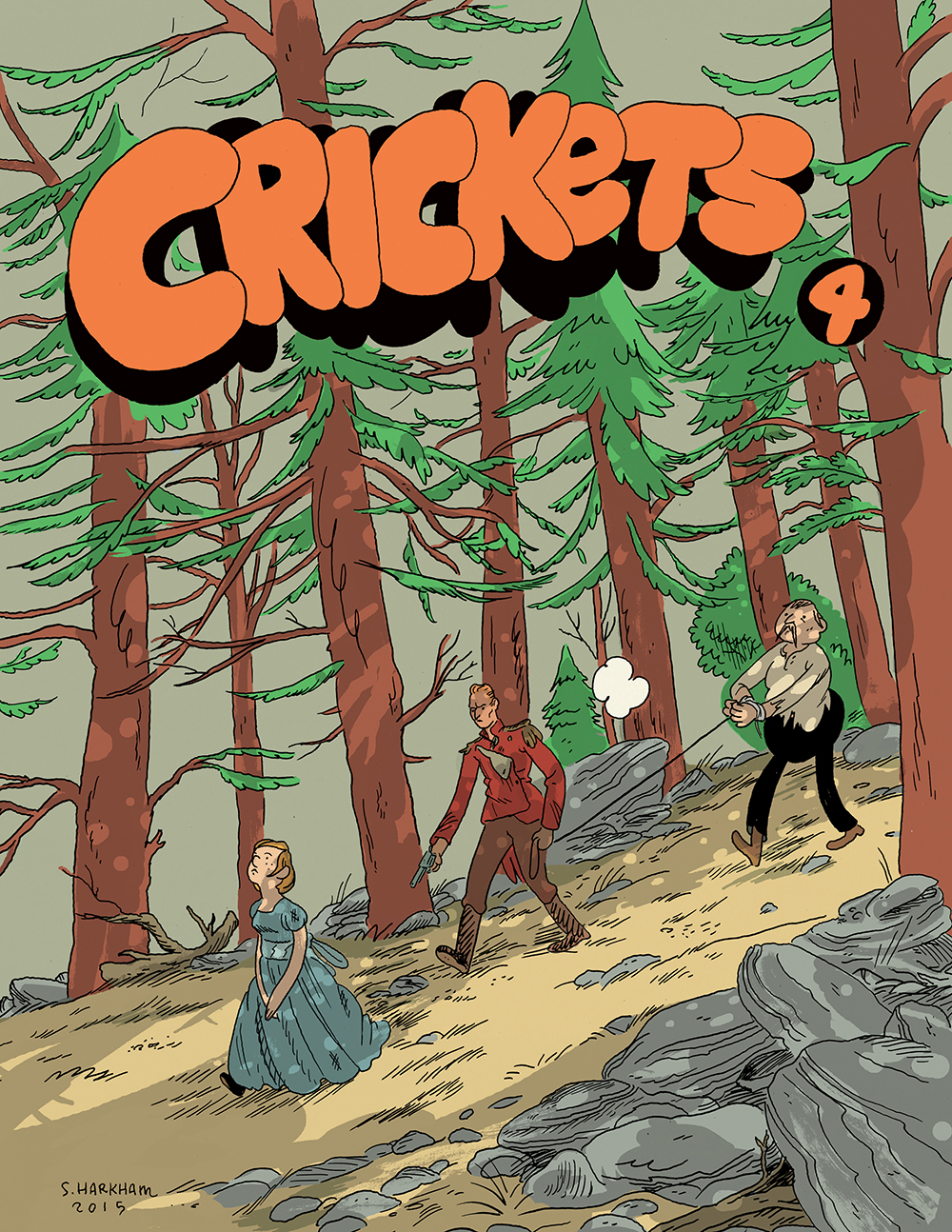
Seymour is the creator of Blood of the Virgin, yet he needs the director, Oswald, to make his movie, even though their visions don’t always correlate. Blood of the Virgin pairs these men together (as the issue’s cover might suggest), but it’s a conflict of power, of who exactly is in charge of this thing and what he wants, that disrupts their relationship and introduces reality to everyone else’s magic moment.  Oswald argues with his lead actor because of a difference in creative choice, and the actor reacts by storming off, asking “is that how you see me, you lousy pecker-wood piece of shit?”. That actor, because of the reality of who has power over him, loses his grasp on his own perception of himself. He may be a creative contributor, but Oswald decides how the audience will see him.

Ironically, this display of authority unseats Oswald. When reports of turmoil between the lead actor and the director reach the film’s financier, it’s decided, by this figure of ultimate authority, that Oswald is unfit for the project, and Seymour is handed the role. Which is what Seymour secretly wants, but with the position he finds how authoritative he must be. It’s a realization Harkham cleverly illustrates when Seymour, as director, must decide whether a take was good or not, and he hesitates in his answer with the entire crew awaiting his response. The lack of confidence Harkham draws on Seymour’s face says it all. That he hasn’t really considered what a director does, but assumed he was capable of it.

At home, Seymour has a wife. She’s introduced as a woman masturbating on a couch despite her baby crying in the other room. Harkham frames this sequence by starting with a closeup on the kid, zooming out, cutting to a large, wide panel of the wife, and then zooming in on her and her ecstasy. He’s transitioning from one image to the other as well as crosscutting them. As a housewife, this mother has great responsibility, but this responsibility can be a cage. As we know, living in our world, plenty of housewives have wanted more, whether professional fulfillment or social freedom. Their position, though some many enjoy it, can be a personal limitation, especially when the husband gets to leave and pursue what he wants. Here, though, Harkham shows this character taking control by attending to herself even though a responsibility requires attention. That she’s doing so over the cries of her child feels a bit disturbing, but it makes the act even more rebellious. It shows that with Seymour away, she isn’t lost.

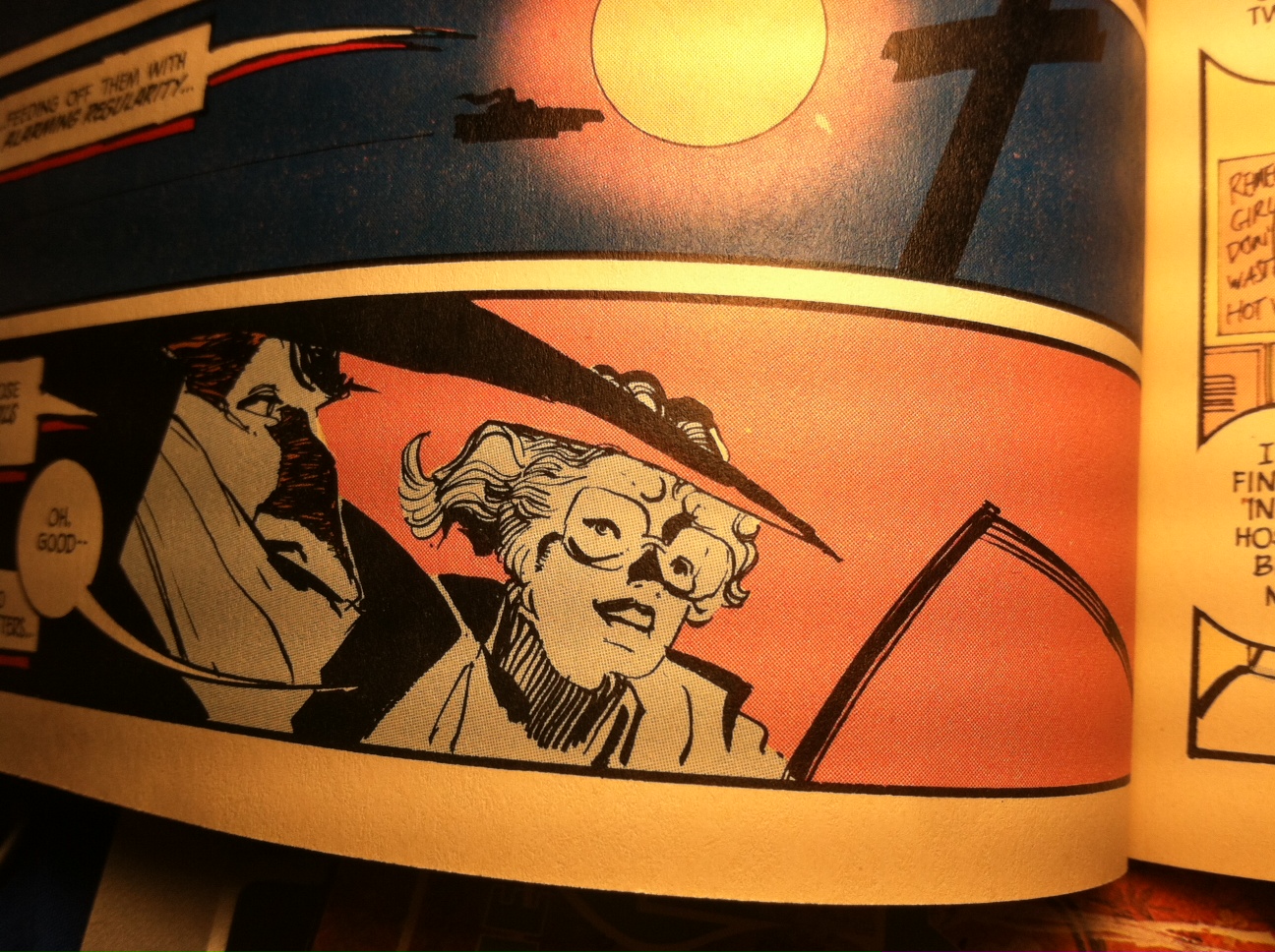
The comic ends with Seymour driving a drunk Oswald home through a desert town outside of Hollywood. A place known as “the palm of God’s hand,” somewhere you imagine great things are possible so long as they aren’t crushed. This is after they’ve fought, and Oswald has lost his position. It’s at a point when Seymour may have a right to ignore the guy. He doesn’t. He drives him home and dumps him on his front lawn. It seems harsh to do it that way, but the fact is Seymour was there when no one else was. He’s using his ability as a human being to care for someone else, in some way. You don’t know if this is where their relationship ends or just takes another turn, but you get the sense there’s some fact found. That off the film set they’re still connected. That they have some power over one another.

Leave a comment

Filed under Uncategorized

Godzilla in Hell by James Stokoe

godzilla

Godzilla in Hell surrounds the character with threats his height (or taller), undercutting his advantage of size. This evens the playing field for the fights James Stokoe stages throughout the comic. More importantly, though, it shows the audience a Godzilla that is at their level who must fight his way across a landscape anchored by various obstacles. These obstacles represent possible demons plaguing Godzilla (his nuclear origin, the people he’s killed, himself), and they trigger emotional responses from a character that’s typically shown as an unstoppable force, confident of his chosen direction.

The final battle, in numerous instances, features Godzilla being thrown around like a chew toy at the whim of an attacker. Stokoe draws the character’s body from low angles in this sequence and focuses more on the whole mass of Godzilla together, in the air, spinning out of control. He elevates this idea by composing the scene through a series of smaller panels that constrict the character. Godzilla’s true size is never far from the audience’s mind, though, because of a prior scene, in which a storm cloud of human beings nearly wipes him away. The cloud itself is huge, but Stokoe shows the tiny grains of its make up, which lends perspective. So when Godzilla breaks loose of the creature in the final battle and smashes him, you think about the absurdity of a 500 foot beast body slamming another 500 foot beast from what’s likely a 3 mile fall, and you’re at once aware of the mega-status of these characters, as well as their shared territory with us. 

The best moments are Stokoe’s brief pauses, where he breaks away from the action and provides us a quick shot of Godzilla’s foot or face reacting to the violence (either in surprise, pain or strain). He does this a few times, and they emphasize the severity of the conflict the character must face. It’s easy in a story like this to do spectacle and excite an audience with colorful images, but it’s an entirely different game to do that and characterize the spectacle with nods to the character’s internal process, even if momentarily. It says more, too, that these nods are close ups. They intimately lend an eye to the actual struggle of these battles, and some even show a physical tole. But Stokoe is smart to keep these leaps short as that’s how they are most interesting. As asides. The audience reads this comic book for the spectacle, mostly. The existential glimpses work as smaller pieces of a whole.

That said, Godzilla in Hell implies opportunity for a deeper reading, if you really wish to, but it’s identity as a battle comic is really enough because of the quieter visual touches Stokoe uses to elaborate Godzilla’s character. They’re proof of Stokoe’s thoughtfulness, even when drawing a Godzilla fight comic set in Hell. The brief, poetic nature of it, too, is all the more special. It reads with a certain pride, though one affected by reality. You can tell he’s thought about all this a long time.   

Leave a comment

Filed under Uncategorized

Rob Liefeld died for us

photo (2)

Granted, so much of Bill Sienkiewicz’s work on The Shadow is the fact that it’s he who does it, but unlike Elektra: Assassin, which was published only a year before, The Shadow isn’t painted by the artist. Sienkiewicz strictly supplies pencils and inks, approaching the assignment in a fashion more typical of work-for-hire commitments. Where Assassin bleeds some sense of artistic dedication, The Shadow, while still quality stuff, isn’t as individualistic. The artist handles two-thirds of the work, and the third, and (in Sienkiewicz’s case) crucial step is trusted to someone else.

This someone could have really dropped the ball, colored this thing like any other book on the stands, but Richmond Lewis, colorist behind Batman: Year One and David Mazzucchelli’s wife, didn’t. A painter herself, she comes at this thing with a particular intuition. She’s conscious of Sienkiewicz’s use of blacks, and knows how to work against that in order to attribute color to them and enliven a field of depth in his drawings.

The above image (though poorly photographed) is possibly a cheap example, but is a clear encapsulation of this. Sienkiewicz starts us on the left side of the panel, steeped in solid black, focusing on the Shadow, but it’s Lewis’ hot pink that moves the eye away and over, revealing a character in the background, opening the image up and shifting our focus. It’s the concisest their collaboration can be summed up, showing Sienkiewicz set the ground work for her to capitalize on.

By 1987 other comics were colored with such craft, but this work on The Shadow shows artists still staking a piece of the coming frontier. It’s interesting to see this amount of thought spurred by advances in technology and the companies’ investment in printing. The script on this book, at best, feels like the work of very trying young writer. It has attitude and energy, but is unnecessarily dense. Yet Lewis and Sienkiewicz ease it, give it charm, and despite the flaws have it come across as a special project. You forget the obvious attempt it made to revamp a Pulp hero and look on it to experience the thing only they can create.

Leave a comment

Filed under Uncategorized

When the door shuts, just know it

3_original

Retrofit Comics sent a few of their latest. Here are thoughts on one of them.

– – –

Theth
Josh Bayer

I’d originally thought the protagonist of Theth was an abnormally large Yeti, crossing some landscape to escape whatever is over its shoulder, but in actuality it’s the small guy wearing the space suit dreaming below, at the bottom of the cover. His name is Seth. Theth, pronounced with a lisp. He’d like to be a Yeti.

The misunderstood ape fits Seth, an adolescent trapped in his own cage of excommunication. They’re both outcasts, kept on the outside by themselves and their dispositions to what surrounds them. Though they survive, they only survive through withdrawal, pulling into primitive means, or in Seth’s case, fictitious delusions sponsored by comic books. And there’s the difference between them. The mountains in that Yeti’s grasp are at least physical — an external force to conquer. Which is why Seth fantasizes this crypto-counterpart. He, too, would enjoy pushing past the terrain inhibiting him, and though this day dream is of something Seth finds alluring, it’s also telling that his go-to allusion is of someone ultimately lonely and forsaken. The cover, if read as so, summarizes the two-sided perspective Josh Bayer brings to Theth. Where what’s shown is understandable as it is horrific.

In the book, Bayer shows us someone incapable of dealing with reality, yet is still affected by it. The main effect is Seth’s spiral into comic book fiction as a means of coping with parents, bullying and wondering whether or not a girl will ever fuck him. A few comics have dealt with this idea before (Farel Dalrymple’s The Wrenchies is a recent one), but Bayer’s take doesn’t seek sympathy as others tend to, especially in terms of the lead character. Because while Seth is pathetic enough at times to feel for, he’s also a member of a world not entirely terrible or just (much like ours), where John Lennon can be murdered though still mourned. In comparison to our actions, Seth’s appear extreme. His step-mother, though unlikable and rough, is still shown as human rather than a cartoon villain responsible for a teenager’s demise. She wants some sense of a connection to her step-son, and her open remorse for Lennon’s death points to someone alive inside the plump, white case her shitty suburban hairdo hides. The very nature of their relationship explains Seth’s distance from her, yet Bayer’s willingness to stop and place more than a-typical exclamations in the step-mother’s mouth, layering little extra pieces of character, shades their interactions differently. It says Seth is not a helpless victim but a coward who’s unable to confront the imperfection coming for him.  Where Bayer could have oped for the empathetic, though unrealistic, nerd in need of our tears, he crafted someone tough to digest.

Other examples within Theth shine a similar light on Seth, but you can read the book for those. If anything, I find Bayer’s complicated take to be a mature one, and one that I’m not sure many other cartoonists would do. Because Seth’s distance is arguably comparable to that of a cartoonist or someone like myself who’s way too obsessed with this shit. There is an element of Theth that celebrates comics. A drawing published in the back of the book, a splash of famous comic characters like Nancy, Dick Tracy and Garfield charging the reader, holding a banner that reads “Make Comics Forever”, certainly implies victory. Though that victory rings differently knowing the ending Theth has is only on the other side of the page. So the conclusion, overall, is confused. It’s great to love comics — to implant them within your life — but at what cost? Or is there a cost? Comics are more the outcome of all the other shit we’ve seen. Their salvation is both wonderful, yet annoying. Because imagine if we didn’t need them. I think Bayer is giving that some thought.

Leave a comment

Filed under Uncategorized

John Romita Jr. and Superman

superman-2

Lately, I’ve found myself geared and ready to spend the money on Marvel and DC super hero comic books. I wouldn’t say this interest is spurred by any deep sense of “giving it all another go.” It’s more like an understanding of what’s available, and yet being interested enough to engage with a system of predictable odds, just to watch men and women of talent rise or fall.

There’s something joyful of when those little, callous hands between the gears slip through and gesture something pure. Even if they get caught in the machinery and bleed, the color red is a sign of life. The job of comics is probably, ultimately, a heartbreaking one, but it must be rewarding when brief moments of success come to and resurrect something cold and dead inside the 9 to 5er. That’s always meant more to me than the lone cartoonist taking all the time in the world to say something calculated; it’s more lifelike to stumble through something. It’s not as if we’re provided forever to sit around and get it together. You have to leave the house by 8 if you’re to make it to work on time, and mainstream grind comics reflect that by they very virtue of what they are. So when something good happens in the scope of all the shit inherently fused to that system, it’s sort of miraculous.

It doesn’t seem that anyone cares about the John Romita Jr.-drawn Superman, despite the fact that John Romita Jr. is drawing it. But I get it. Until last week, I really didn’t either. It’s hard to fucking care about a DC comic book when aware of the company’s mostly awful content and treatment of people. It’s also tough to care about any sort of super hero project, currently, when the genre suffocates all others as well as the men and women working in creative industries. Let alone our larger cultural identity, a subject many have thought and written about. But I like the super hero stuff, just as someone may like crime dramas, pornography or Aphex Twin records. It’s a thing. It’s just a thing that’s wildly popular, marketable and obnoxious in this moment, but surely that will pass, taking us to the next obsession. And when that transition happens, I’ll still like the super hero stuff.

Superman from John Romita Jr., Klaus Janson, Laura Martin and Geoff Johns isn’t something I’ll always remember, but it is good meat and potatoes comics, easing some of the natural, early-20s pain I’ve experienced of late by entertaining me for minutes. It’s also an example of four talented people – talented enough to have found financial and professional success in a system made to exclude nearly everyone – making something unexceptional, though still good. I could sit here and try to decorate some grand reason for this, but in all actuality, it’s a matter of the script these visual artists were given. Johns’ story only calls for so much. A month-in, month-out Superman romp. A fun one, sure, but still a romp. And maybe I shouldn’t even blame Johns. Superman is a DC comic produced for an audience of a particular caliber, sold by a company maintained by consistent product. In fact, there probably isn’t one entity or individual to blame for its regularness. This is most likely a small, left-field detail affected by the world we live in – a world we created in order to always, hopefully, be comfortable.

But if I’m to sit here and type reasons for its faults, I’ll then point to Geoff Johns and say, despite the guy’s ability to write consistent, plot-driven machines (perfect for the market of super hero stories), this one isn’t necessarily very interesting, nor is it uninteresting. Numerous times Superman has met and foiled powerful beings similar to himself. The character of Ullysses marks another addition in that roster.  The only real change in “The Men of Tomorrow” is that Johns drags out the inevitable switch in the character from good guy to bad guy, making you wonder if he’ll keep Superman and Ulysses as allies in order to explore other thoughts. With the end of the latest issue, #35, that doesn’t seem likely, so we’ll go back to the usual program.

The program distinguishes things. Mostly, what goes against or isn’t the program. Romita Jr.’s style and storytelling feels that way to me, especially in this context. At Marvel, despite the objective difference in his work, his contributions come across as something rooted in the company’s history, naturally arrived at through time and evolution. His work is the boiled down effort of Kirby, Miller and his father, Marvel Architects, encapsulated in the plastic figurine of a boy nurtured from day one. But at DC, the antithesis, his work isn’t foreseeable progression but, instead, his own. You can really see it in the way he draws their characters. His Superman, besides the controversial costume adjustment, is still different as this lean and energized version believable in a bar fight as well as outer space. Romita Jr. gives the character a range that’s unfamiliar, that’s against the certain stature of broad shoulders and photo taking Superman usually portrays. Yet the artist never forgets the power essential to this icon. The splash piece above (which in it’s proper form, is actually part of a great layout of panels) conveys exactly the alien force beneath the red and blue carnival clothes, and by covering the pupils of the eyes with solid red, it’s not a moment of lifting a boat to trap a villain, but an instance to release what’s really inside.

You can call this run of Superman a few issues of Romita Jr. doing Romita Jr., and historically, yeah, that’s how we’ll look at this. But that’s essentially why they’re interesting and enjoyable. Because we’re watching an artist simply do his thing, and do it to a highly profitable and recognizable piece of corporate intellectual property. Not everyone in comics gets to this level, and even when the work may feel ordinary for the circumstances, there’s still something amazing about it when you step back and actually look.

Leave a comment

Filed under Uncategorized

Hawkeye #1 | Fraction, Aja, Hollingsworth

You cannot help but feel just a tad cynical when you read this one; you know that in an estimated six issues, Marvel will drop the ball, and “Hawkeye” will just turn into another crossover whore, pushed to double ship each and every month.

You know all of that, and in some sense it dampens the experience, but if anything, we’ll all be able to look back at this one example and know we read a good Hawkeye comic book once, and that in fact, Matt Fraction may not have lost it all, after all.

All we can hope for, right?

“Hawkeye #1” came out better than I expected. Aja was sure to show up in my mind, but to have Fraction hustle as well and write a tight enough script managed to sway opinion and place the thought in my head that “maybe Marvel can still produce something worthwhile.” It’s a script clearly in work with its artist, showing characteristics similar to a “Marvel-style” production effort. And why not? When you have David Aja drawing the book, that seems to be the only smart move. Leave the pacing to the draftsman; leave the tone to the color wheel. And although the palette resides closely to something of a Mazzucchelli Daredevil book, it does lift the environment from basic background filler to more of an organic character.

And Fraction writes to that, connecting Barton’s characterization to the territory he frequents. It’s his way of saying “Hawkeye a.k.a. Clint Barton. Avenger. Human being. No super powers” without going the route of a cheap caption or bad narration. Instead, he seems to lift a little bit from Miller’s Daredevil, blending setting and character together, and arriving at this conclusion that Hawkeye is down to Earth because of where he lives.

The first scene does the most, though, as Fraction puts Barton in the hospital and has him exit in an annoyed rage. That scene boils down who Barton is, introducing the mythical new reader who picked up this first issue, without slowing everything down for the rest of us already aware. It also presents Fraction’s take and the angle that he and Aja are coming from in terms of their run.

He’s put into the hospital because he can be – he’s a somewhat normal guy – but get under his skin, and you should watch out. There’s a fire in that character, or a frustration, and kicking the wheelchair gets that idea across in this nice, sort-of poetic way.

Separate the sequence from the rest of the book ,and you could even consider it a nice little vignette.

“Hawkeye #1” represents more of what I want to see from Fraction as he does his little stint at Marvel: Tight pop comics. I know this won’t last, and “Hawkeye” will just end up the “Daredevil” of this year once Aja departs, but for now I’ll just call this a nice super hero comic book and enjoy it. Maybe part of its appeal is that its just an above-average exception to the super hero rule set these days, but if so, at least it’s some sort of step up.

I’ll silence my cynicism for now.

1 Comment

Filed under Uncategorized