Thoughts: Generation Hope #1-5

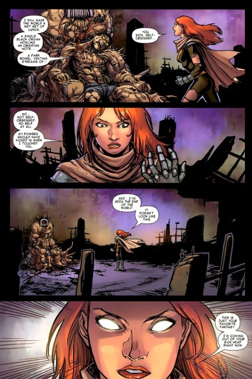
The teenaged super-hero has always been a favorite concept of mine. Applying the struggle and responsibility of super-powers to the ever present  feel of the world hunching on your shoulders as it beats you down into a dysfunctional pulp just sounds like such a rich tapestry of story to me. Ok, maybe that was a bit dramatic, but that is how I look at the archetype of the teen hero. It is about the dysfunction and finding your spot in the world. It is about discovering responsibilities and seeing your potential. It is about showing the world how it should be done as well as disproving the tradition of things. Looking back on the X-men, that has always been their deal as a concept. Generation Hope, being the comic book that it is, makes a lot sense in that way. It is an X-men book that returns to that original notion yet also presents the gifted youngsters in a more offensive fashion. These are the young mutants led by a fiery red head instead of a bald white dude, and this fiery red head, Hope, is acting as messiah in a world where mutants are on the rebound. I am not sure this book reaches its potential, though.

Something Kieron Gillen and Salvador Espin do very well with this series is defining the book’s characters. Issue one is a nice example of selling the audience on the cast. Gillen gives each one of the five leads an appropriate amount of panel time, and from there he delivers a combination of well-constructed dialogue and caption that provide a smooth status for each cast member. Espin carries the definition further by giving each character its own posture and set of facial emotions. He does a nice job of translating Gillen’s ideas of the characters to the visual end. As the reader, you can gain a sense of what each one is thinking by looking. Hope especially is very well presented. She is in no way a back seat driver but rather a character who looks to be on the front and taking charge. Her personality and purpose seem to echo the sentiment of this book. Hope is the next step for the world of X-men, and she houses a strong rebellious spirit that challenges her to go out and show the old dogs (Scott Summers) how it is done. Does she reach that goal, though? Maybe, but I do not think the actual comic does.

Generation Hope is a weird case. The comic book presents an attitude of rebellion and independence through its main character (Hope), yet it does not entirely live up to that attitude as a book even after going as far as to supply some meta-commentary on the idea. Generation Hope is a book not about the icons, but a new generation of merry mutants where the main character presents a very rebellious, independent outlook. The actions of Hope deliver the book’s statement, and it is a statement directed at the current form of Marvel storytelling. Throughout the first four issues, Hope is constantly trying to work against Scott Summers and Wolverine’s direction. They tell her to stand back during the usual super-hero conflict, but instead she pushes past them and jumps right in. By issue five, she is laying down her demands to Scott Summers and claiming she wants to lead her team her way. No more of the expected. Instead, it is time for something new and fresh. It is time to evolve in this period of crisis. The old way has staled and mutants (comics storytelling) is at a lose right now. Action needs taken.

Generation Hope, through its lead character and obvious premise, just  feels like it just wants to rebel and distance itself from the expected Marvel Comic; it comes off as a book that should be tearing apart the orthodox manner of super-hero storytelling. The title itself, “Generation Hope,” implies this sense of something new and exciting on the way. The book rebels through the obvious fact that it spotlights new, young super-hero characters. The cast is capable of anything story wise and could rapidly change in an instant unlike the big properties. On a note of storytelling, narrative, art and energy though, the book is still pretty in line with the rest of Marvel: slow pacing with stretched conflicts, a traditionally structured narrative, and artwork that plays it safe. None of these attributes scream new and exciting comics. It is more a case where the subject matter does not match the delivery system

I do find the book enjoyable as well as the story interesting. The comic’s artwork is nice enough. Espin has a clean style, and the colors laid over his pencils are actually bright rather than the usual Marvel mud. Jamies McKelvie drew the fuck out of issue five. Gillen has a voice for each of the cast. Hope as a lead is exciting to watch. A large consequence feels eminent off panel. On the Marvel Comics Standard, Generation Hope hits the mark as it encourages excitement and a desire to follow, but it fails on a scale of great potential – potential that is implied within the actual book.

The X-men, too me, should be the franchise to push the boundaries of super-hero comics. Metaphorically, they are the outcasts and unorthodox. Generation Hope seems to pick up on that as well as the sense of teenage rebellion. It makes those feelings very clear within the comic and even implies meta-text comments against the expected. The character of Hope embodies the idea of doing something new or different. The actual storytelling behind the comic book does not follow the que given, though. It reads like another super-hero comic and leaves a taste of potential left alone. Not that it should be doing anything completely inventive and new, that’s not what I am saying, but the book feels like it should be told in a way that is not so common among super-hero comics.

There are worse super-hero comics, though. Generation Hope still supplies entertainment and solid craft as well as a plot that draws me back issue to issue. It just does not go that extra step to make it something great.

1 Comment

Filed under Thoughts

Thoughts: FF #1

Jonathan Hickman’s Fantastic Four…You know, I liked the first three issues, but after that the book just toned down and lost my interest. Hickman’s opening story was well-written and forward thinking. It took Reed Richards, a character I usually find terribly boring, in a direction that seemed natural yet surprising. Richards gained a conflict and a new found depth. The questions of work and family came to the forefront. A father, Nathaniel Richards, was found. 

Four issues in though and a bullshit birthday party was the focus as artist Dale Eaglesham took a month off. Granted, it was a one issue downer, but I remember being so surprised by the poor quality of that birthday issue. “We went from that great opener to THIS?” I remember saying to a friend. I dropped the book and soon paid no further attention to Jonathan Hickman’s Fantastic Four.

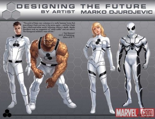
Recent occurrences have caused me to look at the book again. The death of Johnny Storm (Human Torch) to some degree, but more of my revived interested is due to the book’s re-launch and “Future Foundation” concept. I like that name -Future Foundation – and the ideas it implies. They relate back to some of what was happening in Hickman’s opener: Reed Richard’s concern for the future and how far man can possibly go. I like that approach and how it takes the Fantastic Four from being just another set of super-heroes to now some form of super-activists. After all, they were scientists before the powers. Scientists who made it their job to improve the world. The idea of a Future Foundation gets back to that, and it gets to the idea of super-heroes making a difference. Not that the book is actually showing Reed Richards combat deforestation or anything, there is the traditional comic book villainy, but the idea is implied that the FF are about combating the world’s larger problems rather then chasing down the Impossible Man. Nothing new of course, The Authority went after a similar vibe, but I still like that direction for Marvel’s first family.  It feels right; it feels progressive.

Now, concept aside, this actual issue, as a first issue, does not hit all the marks it should. I feel it is a well paced and well structured issue, but I do need feel like it sells the audience on why this is a re-launched title. You know, the “why” in “why change to the Future Foundation?” There is a brief opening with Johnny Storm – a holographic Johnny Storm – where he tells Reed that the team must continue on and take the next step, but that seems to be the only inspiration. I guess it is a fine enough inspiration. The character did die, and that would certainly pull a strong reaction from the other characters. I just feel that the scene, as in the way it was written, was lacking, and it felt pretty cliche. How many times have we seen the holographic message from beyond the grave? How many times has the deceased expressed a wish for his family and friends to venture on? The “done before” nature made the origin of the “Future Foundation” feel weak, and the death angle actually takes you out of it for a moment. The call back to comic book death reminds you that Johnny Storm will probably be back in a year, and the Future Foundation direction will revert back to the classic Fantastic Four. The hologram scene is a weird case where the origin feels like the end, and it doesn’t give the reader much faith in the longevity of the approach.

Also, I did not feel much excitement in this issue. First issues always seem to vamp everything up. They put across to the readers the series’ idea of a status quo and direction. This kind of does that, but it feels like those factors are very second-string. In a way, it is kind of a refreshing thing to see in a world where comic books seem to live and die by the first issue. You know, Hickman sort of just leans back and lets the idea of hype go while focusing only on writing a solid issue. My lack of enthusiasm seems to speak, though. Granted, I will be buying the next issue as this is a well written comic that sports a cool approach. It just felt like another issue of Hickman’s FF though and not what a first issue should be. It was not that attention grabber.

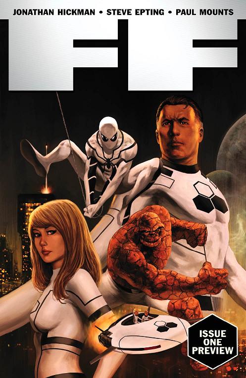
I am interested in where Hickman wants to go with the FF, and I have to say Steve Epting really adds a lot to this comic. An artist with a good sense of page layout and style, Epting gives this book the look that a Hickman comic can work and thrive with. I wish I were better at writing when it comes to art because honestly there is more I would like to say about Steve Epting. His line and look just feel very classic to me. The only thing that takes away from it is the notorious muddy Marvel coloring. With Epting drawing this comic, I would love to see a brighter more stylish palette, but instead Paul Mounts keeps everything gloomy and dirty. Even Spider-man looks dull whipping around New York City. It’s the FF. They are super-scientists. Brighten things up a little with some energetic colors.

Leave a comment

Filed under Thoughts

No Clever Title Needed #3

Here are the thoughts that lack a specific home; they are tossed here.

What a week. Honestly, that is all I can say to describe it. Just so odd. Just so off. That was this week. Not terrible by any means, just odd. I guess that is a pretty vague description, right? Oh well.

This week, or at least something I watched this week, did make me want to move to Portland (Oregon) even more, though. This something would be the short and so appropriately named documentary, Portland Comics.

Moving entirely across the country for a comics scene may seem like a bit much, but to me it would be more than comics…Ok, scratch that, it would be all about comics, but it would be for the community, culture, and lifestyle around the medium rather than actual, physical comic books themselves. At this point in my life, I feel comics are, and forever will be, apart of me.  The medium has me at my heart and mind. I feel I know it so well, yet at the same time have many aspects to learn about it. Comics, as corney and possibly messed up as it may sound, have shaped me into the person I am today. Seriously. Without comics, I would never have podcasted, never have choosen a career in journalism, never have taken an interest in writing or storytelling as strongly as I have, and would never be writing this blog. Also, the ways in which I look at the world…those would probably be different too, as well as the group of friends I hold.

To me it makes sense. Portland does. The comics scene, and the people of it, just feel like a setting I need to be surrounded by. It is a setting I need to exist in. It would bring home and strengthen the idea of comics being a piece of me. Granted, I am going completely off a documentary and other word-of-mouth, but I know that I need to at least visit Portland sometime in the near future. From there, well, we will see what happens.

For now though, the land of Portland, Oregon will remain a wishful thought. One that I may possibly work towards.

———————————————————

Dave Wachter kicks ass. Here is a sweet Galactus piece from him, and it is in color.

Dave’s blog: http://davedrawscomics.blogspot.com/

———————————————-

A friend of mine discovered this really cool short film called Logorama. It is an animated presentation that depicts a universe of brands.

On the surface, this film works as a cute comedy that provides numerous chuckles, but as expected with the subject matter it does dive into its corner of commentary and subversion. The bit that really impressed me was the use and placement of specific brands, such as the use of Ronald McDonald as the villain in the piece. That, ladies and gentlemen, was no accident. I actually think you could probably spend all day watching this film picking out brands and the comments they make.

It is a visually busy film, and I certianly suggestion taking the sixteen minutes to watch it.

http://vimeo.com/10149605

————————————————-

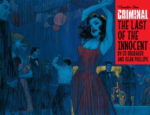
New Criminal.

I am always in the mood for Brubaker and Phillips’ Criminal because it feels like the most natural work these guys produce. This promotional image is excellent. I love the colors and the way the women’s red dress contrasts with the blue of the background, and I also love the vertical streaks casting down like long rain drops.

I have yet to read the latest arc of Incognito from this creative team, and from what I understand those comics may be weak, but I am certainly looking forward to this project. I will be buying.

—————————————-

The Mountain Goats’ latest, All Eternals Deck, is very good, and it has been my playlist of choice over the past two days. With luck, I may actually be seeing them live, in Pittsburgh, on April 12th.

Tracks that impress: Damn These Vampires (1), Birth of Serpents (2), Estate Sale Sign (3), The Autospy Garland (5), High Hawk Season (7), For Charles Bronson (11), and Never Quite Free (12).

Get it.

——————————————————–

The name of Jay Diddilo has become legend to the internet in the past week or two. Why? Well, just blame Rob Granito. If you have not had enough of Jay Diddilo (and really, how could you?), then you must check out the man’s actual website.

Your laugh buds will thank you. Oh, they will thank you. http://jaydiddilo.com/index.php

———————————————-

Last, but not least, Brandon Graham, the artist and creator of King City, has been providing a great daily column over at The Comics Journal all week. This is a must read. The man provides some great artwork along with  fun, quirky bits of internet goodness. Plus, a cool peak into his daily life.

http://www.tcj.com

———————–

Yep. That’s it. Next week I should post something more substantial. For now, enjoy this post, and if you frequent Twitter follow my ass. I want more followers, so I can feel some higher sense of happiness. You want that, right?

twitter.com/alec_berry

2 Comments

Filed under Uncategorized

Image Addiction Review: Savage Dragon #170

As usual I review the new issue of Savage Dragon over at Image Addiction. Here’s what I had to say:

“The page layout matters in comics. The method of how the panels mesh along with the placement of borders and breaks determines the reading experience as well as the pacing.

Well, this issue of Dragon explores that as Larsen shows the effect of page design by repeating one particular layout for basically the entire issue…”

You can read the rest HERE.

Leave a comment

Filed under Image Addiction Review

Image Addiction Review: Butcher Baker, The Righteous Maker #1

I have posted a new review over at Image Addiction on Butcher Baker, The Righteous Maker #1. Here’s what I had to say:

“The new series from Godland’s own Joe Casey (or should I say Joe Casey’s own Godland? – which I guess wouldn’t make any sense) is Butcher Baker, The Righteous Maker: a comic book centered on an ex-super-hero who is now pulled from retirement in order to deal with a few past villains…”

You can read the rest HERE.

Leave a comment

Filed under Image Addiction Review

Where High Concepts Go Wrong

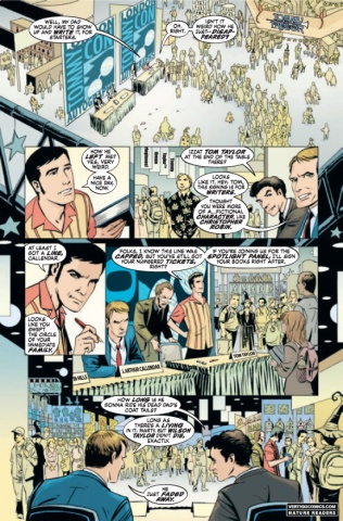
To anyone who followed me in my Teenage Wasteland era, you may remember my slight enthusiasm for a book called The Unwritten. A Vertigo/DC series helmed by writer Mike Carey and artist Peter Gross that explored the ideas of story and culture and their affect upon the world.  Well, after months of being behind in my comic book reading and a week of open time due to spring break, I finally managed to catch up on a majority of the series I follow.  The Unwritten did not impress as it once did.

Now, The Unwritten had already fallen off my radar prior to the spring break catch-up. I was no longer grasping for the next issue. I was no longer reading and re-reading the issues already in my possession. I was no longer playing along, digging into the comic looking for clues or themes. That reaction I had toward The Unwritten died months ago – probably around issue twelve if I were to guess. I did still enjoy the book on some level, though. I thought it was a good series, one that I would certainly gain a likable experience from once reading it in a stack of three or four issues. Not the case.

The Unwritten, the most recent issues, read like a story that had lost its steam. The giant questions and mystery of the series seemed to be gone or on their way to a halt. There was nothing propelling the book anymore. Tom Taylor’s father had been dealt with, Lizzie Hexam was no longer a question to us, Tom seemed to be comfortable with his role: where was the conflict?

I guess there is the question of the map and the world hopping as Tom Taylor, our protagonist, uses the wonderful, little map in his possession  to travel across fictional worlds using a mystified door knob, but this new direction or focus feels very much like some video game – ified version of a comic book. Each setting feels like a new level in a larger scheme of some goal oriented quest, leaving the conflict in a very two-dimensional fashion. The series’ beginning had many subplots buzzing around, and Tom Taylor’s own existence was constantly bombarded with new questions and ideas. Now, it’s world hopping, in video game fashion, to discover this thing titled “the source.”

I don’t know. I am not thrilled or fascinated by it.

The subplots also feel lackluster. Savoy, Tom’s compadre, seems to be turning into a vampire after suffering a bite from the series’ villain, Count Ambrosio, Tom and Lizzie seem to be sexually attracted to each other, and the big, bad organization out to get Tom is applying new management, but none of this compares to the tension the first ten issues of The Unwritten supplied. Big things were happening in those early issues. Questions of perception, presentation of media and the intrusion it makes upon our lives, Tom Taylor being a scared, little man on the defensive, the Frankenstein monster, murder, prison, Nazis, a scary hit man with a bad ass mustache: these things do not compare to what the series focuses on now. Not even close.

Maybe the book has just hit a lull as most ongoing series do, and maybe the blame is all on me as my outlook on comics has changed in the past few months. I think the book has just lost its shine, though.

Or blown its wad.

Here is the thing. The comic book, The Unwritten, is built off a pretty cool high concept. The idea of a fictional character living in our world, fiction and stories crossing paths with our reality, and the idea of dictating truth with fiction are concepts that have been dealt with before, but the Unwritten fused all of this together in an exciting, explosive way that required you to dive full in. Carey applied a piece of the Lost method of storytelling, providing more questions than answers and building a sense of something major lurking in the backdrop. This, along with the high concept, was the hook. As described though, the Lost-like tension has left, and well, the high concept is not exactly as intriguing as it initially was.

Up front, the book’s premise was really attention grabbing. It gave the book some real balls in a sense, making the reader feel like it was possible to get some big answers, big ideas from this 22-page monthly.  How does fiction affect us? What other magic is there to explore? Are we better or worse off with the amount of narrative in or daily lives? I was grinding on this stuff. Then the magic of the premise goes away. Then it just feels like something expected. Then is becomes standard.

The point here is: high concepts are wonderful tools to create initial excitement and interest in the story you wish to tell. High concepts can also provide great starting points or settings for your narrative. Honestly, high concepts are pretty essential to the art of story, as the concept usually is the origin point. I mean, where is Jaws without the giant shark? Where is Homer’s Odyssey without the long trip home? Where is The Pit and the Pendulum without the fucking pendulum? The high concept defines the narrative in a sense, but the narrative needs more than just the high concept. The narrative needs characters, needs conflict, needs suspense, needs subplots, needs dialogue, needs theme, and in the case of comics, needs art – good, or even better, GREAT art.

The Unwritten has a few of these things. The Lizzie Hexam character is still pretty interesting, easily the most compelling cast member. The book certainly has a theme or themes it is exploring. The conflict is there in a sense, just not as fascinating as originally shown. Peter Gross is a good artist, probably one of the better working at Vertigo.

With this selection of elements, though, the comic still dangles. The writing is not strong enough to match or carry on the enthusiasm instilled by the first contact of the premise. The sharp decline in quality is actually more noticeable because the premise grows standard. As a reader, loving this book, you finally look past the high concept and make judgment that the series does not really have a whole lot going on for it. It almost feels like a takeaway, making you question whether the book was really ever something special or just something average covered up by a catchy idea.

I am not completely sold on that idea, though. I do feel the early issues of The Unwritten were something worthwhile. The writing there was worth reading as the early issues had more to them narrative wise. The surprise and energy of the high concept did have a large effect on my enthusiasm, though. That’s what kept me reading. That’s what kept me talking and praising.

When it all died down, though, The Unwritten just did not have the backup quality to ensure my continued interest. The writing was not all there, and the investment it put into its high concept just did not pay off to keep me buying for the entire series run.

I feel that’s the threat of the high concept: they can easily get in the way of a writer actually writing a strong story. It seems like an author could easily forget to check for all the elements a strong narrative requires and instead piggy back on the premise.

In a world where “independent” comics continually strive for the next big high concept gold mine, trying harder and harder to appear more mainstream, you can see where this threat of the high concept could appear worrisome. Writers looking to take this approach need to realize that the premise alone will not keep your narrative strong. The other elements are need; the other elements make the story strong and memorable in the end.

The lack of the other elements is why I am dropping The Unwritten.

Leave a comment

Filed under Uncategorized

Location, Location

What’s up? It is back to the grind of academia as spring break has come to a close, and I am now once again sitting in my dorm room, preparing for the onslaught of class. I, for one, can’t wait! (That’s fucking sarcasm.)

Anyway, I have this writing assignment due in my journalism class tomorrow, and I just wanted to post it to share. I kind of liked how it turned out. The assignment was to pick a location and simply observe it; then, I had to record my observation in some sort of romanticized prose piece. I, of course, picked U92FM (the college station I work for) as my location.

It’s short – meant to be – but I hope you will give it a look. I probably could have actually told you about a few of the posters if I took better notes, but yeah. I guess there is always next time. Peace!

———————

Voices raise in the other room. The station’s sports staff begins, what seems, a usual series of bickering and debate, shouting off the results of last night’s competitions and statistics in order to prove some sort of point. Underneath their speech, light music drifts and resonates from the open DJ booth. A mix of alternative rock, electronica and David Bowie sound to be the sound. It casts upward and travels to as many ear drums it can land upon.

This duo of sound is present, rocking to life the college radio station, but the back room of U92FM remains still. No one is there, and it appears to be a place to escape. Upon entering it though, you find you are still surrounded.

The room is small with box-like proportions, yet four office style chairs, ones with dark leather covering and bold, rolling wheels, pack the room as they wait for their inhabitants to return. Posters hang all along the walls in an onslaught of visual sex and pop culture identity.

Debris scatters about the music director’s desk, indicating an existence and an activity. Boxes and stacks of CDs pile in an adjacent corner, towering over the carpet below, casting a shadow that is sure to touch your feet as you cross the threshold of the door.

A magazine rack showcases old Rolling Stones and College Music Journals as if championing some message. Two Dell Desktops hum their electric notes as they lock up and wait for their next Facebook visits.

There is life in this room. Life in the objects. Life in the culture. Everything about the U92 DJ staff is expressed, and they are not even there.

Leave a comment

Filed under Uncategorized

No Clever Title Needed #2

When thoughts cannot stand on their own, they are tossed here, into a blog post that can go anywhere. More random thoughts for your soul! Or your brain. Or something.

I travelled to Pittsburgh, Pa this past Thursday in order to take part in Norma Jean’s recent tour. For those on the outside, Norma Jean is a pretty sweet metal/hardcore group, and I enjoy them very much. Now, while this was not my first show, or “concert” as the old term goes, it was the first one where I was actually a big fan of the performer. Granted, KISS and Anamanaguchi (whom I have both seen) put on fun, exciting shows, but there is something extra when watching a live performance and you know the exact moment to nod your head or pluck your air guitar. I had that experience, and I totally lived it, pushing my way to the front of the crowd, taking part in the pushing and shoving as the music drilled on. The time was great, and Mr. Smalls Theater, the venue hosting the show, definitely holds a cool aesthetic quality as it still showcases a few stain glass windows from the times when it was a church.

Here are a few (blurry) pictures of the show:

Norma Jean at Mr. Smalls

Norma Jean at Mr. Smalls

Norma Jean at Mr. Smalls

————————————————————–

A year ago, my opinion on Brian Michael Bendis was not very positive. Today, I cannot get enough of this guy. Why the sudden shift? I have learned to look past the “evil company man” reputation and see Bendis’ work for what it really is. Yes, the guy’s work does dictate the Marvel line of comics to some degree, and, yes, he does cheerlead for Marvel quite a bit, but I feel these acts now geniune rather than cycnical. His recent activity shows me that this guy is still very much an artist first and a sales man second. The Bendis Tapes, over on the Word Balloon Podcast, have been pretty straight forward the past few months, and the guy has been launching a whole slew of new creator-owned projects while also making his main line Marvel work shine.Bendis is the real deal, as he probably always has been.

Most may complain that his Avengers talk too much, but that is the take, and I for one find it very interesting. Not because they are talking necessarily but because Bendis is using the dialogue to explore the super-hero genre in a different light, showing these characters as the people they really are, wrapping their lives in a Mighty Marvel drama while backdropping against time travel, Civil Wars, and Norman Osborn.

So, I am on “Team Bendis” as you may call it. At least, that is what my buddy Joey Aulisio calls it. I am picking up a majority of his work right now, and I am excited about what this guy is doing in comics because I feel Bendis still have things to say. He is not a hack nor does he phone anything in.

With this recent positivity, I have even returned to titles such as Avengers and Ultimate Spider-man. Books I loved at one time and then dropped due to my “anti-corporate comics” phase, I am now back with, rapidly picking up any and all backissues I can find from the time I have missed. So far, my actions have been successful, nearly having all the books I need to read the entire sagas of Bendis’ Avengers and Spider-man work.

So, the point? I like Bendis again.

——————————————————————-

I know not much of Jim Shooter, the one time editor-in-chief of Marvel Comics, but I really enjoy his new blog.

It is basically Jim Shooter chronicled as he, by way of his handy computer assistant, relates to us his own history in the comics industry. And hey, he is detailing the events chronologically.

Jim Shooter can be a guy with a bad reputation, but if you are not already, read this guy’s blog. I am learning a lot.

http://www.jimshooter.com/

—————————————————————-

Mark Waid on Daredevil, eh? To be honest, I was really looking forward to the announcement of the new Daredevil creative team, but when I first heard Waid I figured that would be a book I skip. Now, I am not so sure. Waid has given an interview discussing his plans and take, and I like what he has to say so far as he looks to bring back the “swashbuckling,” high-adventure Daredevil. Granted, he says the book will still retain some of its crime elements, but I could go for a Daredevil fighting Stilt-man. That is a Daredevil I have never actually read while in comics because the DD title has been consistantly noir ever since I began. Waid’s take could prove to be a nice change of pace. Plus, the guy has Paolo Rivera and Marcos Martin at his disposal. Those are good artists.

Daredevil by Marcos Martin

As for Greg Rucka on Punisher? I feel like I am skipping that. I like Rucka’s writing well enough, but from what he described it sounds like another Punisher book that delves into the dark and gritty environment of street crime and guns. That stuff is cool, yeah, but I have read it before, and Rucka is not high enough on my list to make me excited about that take on the Punisher.
————————————————

I have other thoughts, but I want to turn those into full blog posts of their own. So, as usual, thanks for reading and comments are always welcome. I see the numbers for this thing, so I know people read it; I just need to hear from you.

1 Comment

Filed under Uncategorized

Image Addiction Review: Mice Templar Vol. 3 #3

Cover of Mice Templar Vol. 3 #3

I have posted a new review over at Image Addiction on Mice Templar Vol. 3 #3. Here’s what I had to say:

“Mice Templar may work really well if your taste leans toward the genre of fantasy, but if not the reading experience could come off slightly clunky and maybe even a bit boring…”

You can read the rest HERE.

Leave a comment

Filed under Image Addiction Review

Thoughts: Atelier by Gabriel Ba and Fabio Moon

2 Panels from Atelier

Probably best known for their work on Casanova, Umbrella Academy and 2010’s Daytripper, Gabriel Ba and Fabio Moon do have a side to their work that is a tad more alternative. The books may not be more alternative in terms of content necessarily because, face it, Casanova is pretty unique and off the beaten path, but books from these gentlemen have been published outside the normal circles. The first thing in my mind is 2004’s Ursula from AiT/Planet LAR which was a nice example of a comic of a different format. Ursula was printed upon a smaller form factor, technically making it one of those “mini comics” all the kids rave about. The kids do, do that, right?

Anyway, Ursula had some very delightful artwork that certainly showed the skill of both brothers, but in terms of narrative Ursula felt a bit lacking. The book felt like it was trying to make some underlying statement, yet the contents of that statement were not presenting themselves correctly. The reading experience of Ursula felt like those moments where you can not find the right words to express yourself and the point you wish to make cannot completely escape. At least to me.

But, hey, Atelier! That is why I have brought you to this blog post, right?

This comic, which also displays a smaller form factor, made its North American deput at 2010’s New York Comic Con, but the book soon became available online to appease the masses. Going in, I was not totally sure what this comic would be as it was only described to me as a comic not hindered by any language barrier. A blurb like that sold me the concept of a purely visual narrative, but in terms of what that narrative would be I had no clue. I like both of these artists, though, so that was enough to make me spend the money.

Atelier is great for two reasons, both which involve the narrative. Now, before you yell out, cursing my ignorance of the artwork, please, I wish to include the artwork as a part of the narrative’s success. This is a comic with very minimal text; the only bits to tradionally read are the few sparce sentences injected at the chapter breaks, and these sentences only tend to translate one base thought. The rest is entirely on the art, and Ba and Moon show skill by how they decide to communicate their idea, using an array of public symbols.

The book begins with images of an apple and a lightbulb, both classic visual representations of the spawning idea. It is where the book begins, in the conception stage of the creative procress, and from there it wanders through the different levels of creating. Creating a comic book, specifically. It is an account of the process, that is what this comic book is, and it is an account done with a romantic styling, giving the piece a very poetic tone. Ba and Moon show aspects of the “magic” and limitlessness behind making comics. Their narrative evokes the feeling that comics can go in all directions and know no boundaries.  

More importantly though, Atelier shows the audience what comics are all about: visual narrative. Again, pulling in symbolism and sequential workings, this comic stands up as a nice piece and nice physical example of what comic books are about. Nothing is said by text, yet so much is communicated by just the use of the puzzle imagery between chapters, let alone the more intricate pages.

And I do really like the puzzle imagery. It works very well in the chapter breaks as they transition the reader from one stage of the creative process to another, showing the creation coming together. The design of it shows how making comics is a process and not just an instant happening. There is a working to it, there is a formula, and all the elements of creation must fit together.  The process also is mirrored in the expressions of the brothers themselves as they do depict their own forms in the comic. The appearances vary. Most of the time Ba and Moon are walking about the fictional worlds they create, providing a smiling expression, but what are more interesting are the brief glimpses of the actual process – the work element. Ba and Moon show themselves hunched over drawing tables wearing tired expressions and dropy eyes, and this is important because it shows the hard work and dedication that is necessary to create a comic book. Sure, the process is enjoyable and does house some sense of “magic”, but also it is not an easy goal to accomplish and, for Ba and Moon to show that, it is a nice touch to the detail of the comic.

Keeping the poetic tone though, the comic ends up at a point where the excitement and awesome of comics is at its best as the brothers place us in a scene involving jetpacks, strange looking characters, and an exotic location. It stands to seal away the point: comics can do anything and be anything – comics are awesome.

Atelier stands to be a great statement. It says what comics are, what they can be, and why they are so cool. The book really is a nice, little physical piece of art, and it packs a punch. If you do not own this, well, you better get on that. Follow this link and pick it up. It’s only $3.

Leave a comment

Filed under Thoughts