Category Archives: Thoughts

Thoughts: First Wave #1-6

Too bad this failed. It had potential.

Not that I am a big supporter of the golden age or pulp heroes. Most of them uninterest me and bringing them back just feels regressive rather than cute. With Brian Azzarello’s voice though, the golden age suddenly peaks my curiousity. I am in no fashion a huge Azzarello fan as most of his work still remains unread by me, but I have experienced the epic 100 Bullets. That comic and its well focused narrative are enough to keep Azzarello’s name in my sight line. Plus, the concepts of power and agenda tossed around in 100 Bullets seem to be appropriate for a story about golden age super-heroes. They walk as gods among men, and being set in some form of the DC Universe (because, you know, of Batman) they represent the first of a new breed. As George Washington would like to think, precedence is everything, and these characters are setting it for the “superman.” Power and agenda have a lot to in that situation. At least, that’s how I see it.

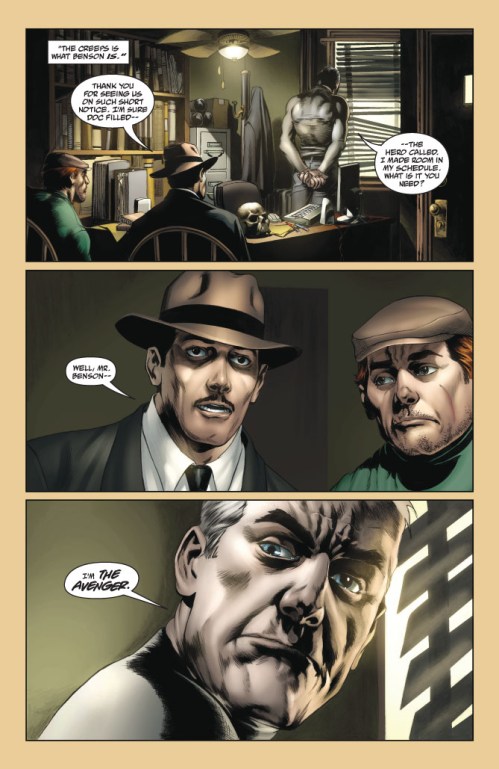
Some of these ideas were brought about in First Wave. Azzarello touches upon being post-human and leaving a good example. The story just falls on its execution, and it sometimes becomes down right confusing. First Wave involves a plot where Doc Savage, The Spirit, and Batman are all brought together to stop a post-war mad scientist, and this scientist’s mad scheme seriously feels like a rip-off of  Kevin Spacey’s Lex Luthor. Not that I even mind a threat similar to something I have seen before. There is plenty of room for a writer to approach common threats  from different angles, but the Superman Returns threat, Luthor building his own island, was pretty weak to begin with. A mad man running off to his own land is in no way comparable to a mad man invading the citizen territory. The invasion factor creates  fear by taking away the idea of santuary. Mad man on his own island? Oh well, at least he is not bugging the rest of the world. Azzarello then brings nothing new to this conflict. He still directs the characters toward the super-island where they sneak around and fight henchmen. A dinosaur does appear, and it does fight The Spirit – which is kind of cool in a weird nerdy way. That’s the extent of excitement in the fight, though. Especially since Rags Morales brings absolutely nothing to this comic besides artwork I would rather not look at.

Morales likes to split the page horizontally…a lot. Now while this technique can be affective in conveying a widescreen sensibility, a horizontal split can disrupt a page’s ability to build a sense of speed. Smalls panels or large-count grids add something to a comic’s pacing. They can cause the reader to read faster as their eyes do not linger on small panels as long as wide panels. Look at this Savage Dragon example:

Small, little slivers of the page (the whole page can be seen somewhere else on the internet). This example comes from Savage Dragon #168, the conclusion to the book’s “Emerpor Dragon” arc. Erik Larsen captured much excitement from the audience with this story, and this moment acts no different as the conclusion draws close. This point in the plot shows the meeting of Dragon and Darklord, a character important to the series, and it stands as a scene of excitement and pushes the reader toward the resolution. The artwork and panel design reflects that completely. Ignoring the dialogue, you zip through this portion of the comic at a rapid pace. The panels feel like brief flashes, the sense of claustrophobia they carry increases the reader’s heartrate, and the close focus along with the bright flares of red and pink grip the eye’s focus.

Now look at the Morales example:

Long, dimly lit panels that seem to carry a lot in their gutters. For a helicopter boarding a plane, you would think the prensentation would appear exciting, but no…Morales gives us one, measly, wide panel and expects it to completely capture this action in the story. There probably is much more to landing a helicopter within a plane than one long focus shot, but no attempt is made to show it. Instead, the details lie in the panel gutters and the story gains no sense of visual appeal or energy.

The coloring on this book also acts a detriment. I understand that colorist Nei Ruffino is probably going for the “noir” look, but I think the dimness in his colors really adds to the snore factor this comic suffers from. Never did my eyes perk up. Rather, they fell into a state of drowsiness, and I honestly had a hard time finishing this comic because of how unexciting it looked.

Let’s get back to the “confusing” statement I made earlier, though. I jumped over it. Azzarello threads this plot together in a jarring manner. The cast starts out seperated but then must come together, but they come together in a car crash way. I really cannot even remember how Doc Savage meets Batman and Batman meets the Spirit. Why? I don’t even think I knew when I read it. It just seemed to happen. The Spirit is tricked by some scum bag to investigate a suspicious delivery truck, which then turns out to house Doc Savage’s father’s body. Bruce Wayne (Batman) is contacted by the mad scientist to join him, so Bruce ends up on the island. The rest show up at some point. Granted, Azzarello does spend time jumping around the cast in order to show their progression through the story, it’s not like he just literally throws the cast on the island, but the writing makes it feel that way. The subplots never feel fully form, and the main conflict actually feels undetermined until about halfway through the series.

I am also confused as to when this story takes place. Guts tells me post-WWII, around the time the actual golden age of comics took place, but other details within the artwork seem to suggest otherwise. Character designs span from clothing that looks 1940s-esque to football jerseys and outfits that resemble the modern day. It just comes off as inconsistant. Plus, it does not help give this world a visual definition. The intergration of modern day technology could help defne the world. Like a juxtapositon between 1940s apparal and jargon and modern day computers and iPods. The mix and match of clothing and character style seems to take the “golden age meets today” idea a bit far though, and it completely throws it off.

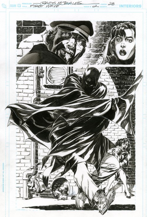
One compliment I will pay: I feel Azzarello did a really nice job capturing the voices of Doc Savage, Spirit, and Batman. Each sounds how I would expect them too. Thier dialogue stands out when they all share a panel. Also, I will give Rags Morales this one page:

I just like the way he draws Batman here, like a big, black sheet that just eats that crook. It’s a cool visual.

I have to say this was poor, though, and I feel Azzarello may have just let this happen. He is the type of writer, like Ellis, to take a corporate gig and just churn out something that is well enough yet does impress. The help of delays and impending doom for the First Wave line may have also contributed to a lack of interest on Azzarello’s part. Oh well. I am not done with the work of Brian Azzarello, and I still remain excited for his next two projects, Batman: Knights of Vengeance and Spaceman, because they involve the other half of 100 Bullets: Eduardo Risso. Those two working together should produce some quality, and speaking of Risso…maybe he should have drawn First Wave?

If he did, I would have automatically liked it a lot more.

2 Comments

Filed under Thoughts

Thoughts: Generation Hope #1-5

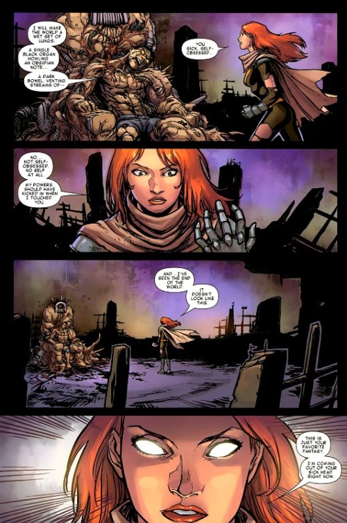
The teenaged super-hero has always been a favorite concept of mine. Applying the struggle and responsibility of super-powers to the ever present  feel of the world hunching on your shoulders as it beats you down into a dysfunctional pulp just sounds like such a rich tapestry of story to me. Ok, maybe that was a bit dramatic, but that is how I look at the archetype of the teen hero. It is about the dysfunction and finding your spot in the world. It is about discovering responsibilities and seeing your potential. It is about showing the world how it should be done as well as disproving the tradition of things. Looking back on the X-men, that has always been their deal as a concept. Generation Hope, being the comic book that it is, makes a lot sense in that way. It is an X-men book that returns to that original notion yet also presents the gifted youngsters in a more offensive fashion. These are the young mutants led by a fiery red head instead of a bald white dude, and this fiery red head, Hope, is acting as messiah in a world where mutants are on the rebound. I am not sure this book reaches its potential, though.

Something Kieron Gillen and Salvador Espin do very well with this series is defining the book’s characters. Issue one is a nice example of selling the audience on the cast. Gillen gives each one of the five leads an appropriate amount of panel time, and from there he delivers a combination of well-constructed dialogue and caption that provide a smooth status for each cast member. Espin carries the definition further by giving each character its own posture and set of facial emotions. He does a nice job of translating Gillen’s ideas of the characters to the visual end. As the reader, you can gain a sense of what each one is thinking by looking. Hope especially is very well presented. She is in no way a back seat driver but rather a character who looks to be on the front and taking charge. Her personality and purpose seem to echo the sentiment of this book. Hope is the next step for the world of X-men, and she houses a strong rebellious spirit that challenges her to go out and show the old dogs (Scott Summers) how it is done. Does she reach that goal, though? Maybe, but I do not think the actual comic does.

Generation Hope is a weird case. The comic book presents an attitude of rebellion and independence through its main character (Hope), yet it does not entirely live up to that attitude as a book even after going as far as to supply some meta-commentary on the idea. Generation Hope is a book not about the icons, but a new generation of merry mutants where the main character presents a very rebellious, independent outlook. The actions of Hope deliver the book’s statement, and it is a statement directed at the current form of Marvel storytelling. Throughout the first four issues, Hope is constantly trying to work against Scott Summers and Wolverine’s direction. They tell her to stand back during the usual super-hero conflict, but instead she pushes past them and jumps right in. By issue five, she is laying down her demands to Scott Summers and claiming she wants to lead her team her way. No more of the expected. Instead, it is time for something new and fresh. It is time to evolve in this period of crisis. The old way has staled and mutants (comics storytelling) is at a lose right now. Action needs taken.

Generation Hope, through its lead character and obvious premise, just  feels like it just wants to rebel and distance itself from the expected Marvel Comic; it comes off as a book that should be tearing apart the orthodox manner of super-hero storytelling. The title itself, “Generation Hope,” implies this sense of something new and exciting on the way. The book rebels through the obvious fact that it spotlights new, young super-hero characters. The cast is capable of anything story wise and could rapidly change in an instant unlike the big properties. On a note of storytelling, narrative, art and energy though, the book is still pretty in line with the rest of Marvel: slow pacing with stretched conflicts, a traditionally structured narrative, and artwork that plays it safe. None of these attributes scream new and exciting comics. It is more a case where the subject matter does not match the delivery system

I do find the book enjoyable as well as the story interesting. The comic’s artwork is nice enough. Espin has a clean style, and the colors laid over his pencils are actually bright rather than the usual Marvel mud. Jamies McKelvie drew the fuck out of issue five. Gillen has a voice for each of the cast. Hope as a lead is exciting to watch. A large consequence feels eminent off panel. On the Marvel Comics Standard, Generation Hope hits the mark as it encourages excitement and a desire to follow, but it fails on a scale of great potential – potential that is implied within the actual book.

The X-men, too me, should be the franchise to push the boundaries of super-hero comics. Metaphorically, they are the outcasts and unorthodox. Generation Hope seems to pick up on that as well as the sense of teenage rebellion. It makes those feelings very clear within the comic and even implies meta-text comments against the expected. The character of Hope embodies the idea of doing something new or different. The actual storytelling behind the comic book does not follow the que given, though. It reads like another super-hero comic and leaves a taste of potential left alone. Not that it should be doing anything completely inventive and new, that’s not what I am saying, but the book feels like it should be told in a way that is not so common among super-hero comics.

There are worse super-hero comics, though. Generation Hope still supplies entertainment and solid craft as well as a plot that draws me back issue to issue. It just does not go that extra step to make it something great.

1 Comment

Filed under Thoughts

Thoughts: FF #1

Jonathan Hickman’s Fantastic Four…You know, I liked the first three issues, but after that the book just toned down and lost my interest. Hickman’s opening story was well-written and forward thinking. It took Reed Richards, a character I usually find terribly boring, in a direction that seemed natural yet surprising. Richards gained a conflict and a new found depth. The questions of work and family came to the forefront. A father, Nathaniel Richards, was found. 

Four issues in though and a bullshit birthday party was the focus as artist Dale Eaglesham took a month off. Granted, it was a one issue downer, but I remember being so surprised by the poor quality of that birthday issue. “We went from that great opener to THIS?” I remember saying to a friend. I dropped the book and soon paid no further attention to Jonathan Hickman’s Fantastic Four.

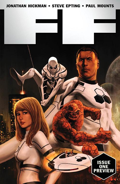
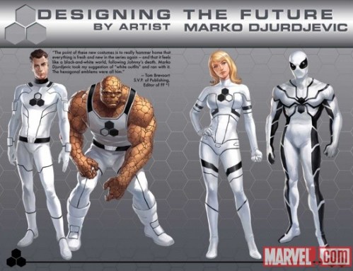
Recent occurrences have caused me to look at the book again. The death of Johnny Storm (Human Torch) to some degree, but more of my revived interested is due to the book’s re-launch and “Future Foundation” concept. I like that name -Future Foundation – and the ideas it implies. They relate back to some of what was happening in Hickman’s opener: Reed Richard’s concern for the future and how far man can possibly go. I like that approach and how it takes the Fantastic Four from being just another set of super-heroes to now some form of super-activists. After all, they were scientists before the powers. Scientists who made it their job to improve the world. The idea of a Future Foundation gets back to that, and it gets to the idea of super-heroes making a difference. Not that the book is actually showing Reed Richards combat deforestation or anything, there is the traditional comic book villainy, but the idea is implied that the FF are about combating the world’s larger problems rather then chasing down the Impossible Man. Nothing new of course, The Authority went after a similar vibe, but I still like that direction for Marvel’s first family.  It feels right; it feels progressive.

Now, concept aside, this actual issue, as a first issue, does not hit all the marks it should. I feel it is a well paced and well structured issue, but I do need feel like it sells the audience on why this is a re-launched title. You know, the “why” in “why change to the Future Foundation?” There is a brief opening with Johnny Storm – a holographic Johnny Storm – where he tells Reed that the team must continue on and take the next step, but that seems to be the only inspiration. I guess it is a fine enough inspiration. The character did die, and that would certainly pull a strong reaction from the other characters. I just feel that the scene, as in the way it was written, was lacking, and it felt pretty cliche. How many times have we seen the holographic message from beyond the grave? How many times has the deceased expressed a wish for his family and friends to venture on? The “done before” nature made the origin of the “Future Foundation” feel weak, and the death angle actually takes you out of it for a moment. The call back to comic book death reminds you that Johnny Storm will probably be back in a year, and the Future Foundation direction will revert back to the classic Fantastic Four. The hologram scene is a weird case where the origin feels like the end, and it doesn’t give the reader much faith in the longevity of the approach.

Also, I did not feel much excitement in this issue. First issues always seem to vamp everything up. They put across to the readers the series’ idea of a status quo and direction. This kind of does that, but it feels like those factors are very second-string. In a way, it is kind of a refreshing thing to see in a world where comic books seem to live and die by the first issue. You know, Hickman sort of just leans back and lets the idea of hype go while focusing only on writing a solid issue. My lack of enthusiasm seems to speak, though. Granted, I will be buying the next issue as this is a well written comic that sports a cool approach. It just felt like another issue of Hickman’s FF though and not what a first issue should be. It was not that attention grabber.

I am interested in where Hickman wants to go with the FF, and I have to say Steve Epting really adds a lot to this comic. An artist with a good sense of page layout and style, Epting gives this book the look that a Hickman comic can work and thrive with. I wish I were better at writing when it comes to art because honestly there is more I would like to say about Steve Epting. His line and look just feel very classic to me. The only thing that takes away from it is the notorious muddy Marvel coloring. With Epting drawing this comic, I would love to see a brighter more stylish palette, but instead Paul Mounts keeps everything gloomy and dirty. Even Spider-man looks dull whipping around New York City. It’s the FF. They are super-scientists. Brighten things up a little with some energetic colors.

Leave a comment

Filed under Thoughts

Thoughts: Atelier by Gabriel Ba and Fabio Moon

2 Panels from Atelier

Probably best known for their work on Casanova, Umbrella Academy and 2010’s Daytripper, Gabriel Ba and Fabio Moon do have a side to their work that is a tad more alternative. The books may not be more alternative in terms of content necessarily because, face it, Casanova is pretty unique and off the beaten path, but books from these gentlemen have been published outside the normal circles. The first thing in my mind is 2004’s Ursula from AiT/Planet LAR which was a nice example of a comic of a different format. Ursula was printed upon a smaller form factor, technically making it one of those “mini comics” all the kids rave about. The kids do, do that, right?

Anyway, Ursula had some very delightful artwork that certainly showed the skill of both brothers, but in terms of narrative Ursula felt a bit lacking. The book felt like it was trying to make some underlying statement, yet the contents of that statement were not presenting themselves correctly. The reading experience of Ursula felt like those moments where you can not find the right words to express yourself and the point you wish to make cannot completely escape. At least to me.

But, hey, Atelier! That is why I have brought you to this blog post, right?

This comic, which also displays a smaller form factor, made its North American deput at 2010’s New York Comic Con, but the book soon became available online to appease the masses. Going in, I was not totally sure what this comic would be as it was only described to me as a comic not hindered by any language barrier. A blurb like that sold me the concept of a purely visual narrative, but in terms of what that narrative would be I had no clue. I like both of these artists, though, so that was enough to make me spend the money.

Atelier is great for two reasons, both which involve the narrative. Now, before you yell out, cursing my ignorance of the artwork, please, I wish to include the artwork as a part of the narrative’s success. This is a comic with very minimal text; the only bits to tradionally read are the few sparce sentences injected at the chapter breaks, and these sentences only tend to translate one base thought. The rest is entirely on the art, and Ba and Moon show skill by how they decide to communicate their idea, using an array of public symbols.

The book begins with images of an apple and a lightbulb, both classic visual representations of the spawning idea. It is where the book begins, in the conception stage of the creative procress, and from there it wanders through the different levels of creating. Creating a comic book, specifically. It is an account of the process, that is what this comic book is, and it is an account done with a romantic styling, giving the piece a very poetic tone. Ba and Moon show aspects of the “magic” and limitlessness behind making comics. Their narrative evokes the feeling that comics can go in all directions and know no boundaries.  

More importantly though, Atelier shows the audience what comics are all about: visual narrative. Again, pulling in symbolism and sequential workings, this comic stands up as a nice piece and nice physical example of what comic books are about. Nothing is said by text, yet so much is communicated by just the use of the puzzle imagery between chapters, let alone the more intricate pages.

And I do really like the puzzle imagery. It works very well in the chapter breaks as they transition the reader from one stage of the creative process to another, showing the creation coming together. The design of it shows how making comics is a process and not just an instant happening. There is a working to it, there is a formula, and all the elements of creation must fit together.  The process also is mirrored in the expressions of the brothers themselves as they do depict their own forms in the comic. The appearances vary. Most of the time Ba and Moon are walking about the fictional worlds they create, providing a smiling expression, but what are more interesting are the brief glimpses of the actual process – the work element. Ba and Moon show themselves hunched over drawing tables wearing tired expressions and dropy eyes, and this is important because it shows the hard work and dedication that is necessary to create a comic book. Sure, the process is enjoyable and does house some sense of “magic”, but also it is not an easy goal to accomplish and, for Ba and Moon to show that, it is a nice touch to the detail of the comic.

Keeping the poetic tone though, the comic ends up at a point where the excitement and awesome of comics is at its best as the brothers place us in a scene involving jetpacks, strange looking characters, and an exotic location. It stands to seal away the point: comics can do anything and be anything – comics are awesome.

Atelier stands to be a great statement. It says what comics are, what they can be, and why they are so cool. The book really is a nice, little physical piece of art, and it packs a punch. If you do not own this, well, you better get on that. Follow this link and pick it up. It’s only $3.

Leave a comment

Filed under Thoughts